The Independent Market Observer

4/25/13 – Slowdown, Employment, and Corporate Profits

April 25, 2013

Several data points have come through in the past couple of days that support some thoughts I’ve had for a while. I think it’s constructive to take a look at them to determine how we can expect the economy and financial markets to evolve in the near future.

Continue reading → Leave a comment

4/8/13 – A Deeper Look at the Employment Slowdown

April 8, 2013

Unsurprisingly, last week’s disappointing employment results have generated quite a bit of discussion. The most interesting part for me has been a quantitative finding from Ned Davis Research: if you compute the actual hours worked, given the number of jobs and the increase in the average work week, it’s the equivalent of another 328,000 jobs added. Therefore, the aggregate hours worked—the actual labor input into the economy—actually rose 0.3 percent rather than declining, and the increase is pretty strong, above the 12-month average.

Continue reading → Leave a comment

1/30/13 – A Look at Unemployment Insurance Claims

January 30, 2013

Guest post from Peter Essele, CFA, senior investment research analyst

Every Thursday, the talking heads on CNBC make a big fuss about the initial claims numbers, pointing out whether they’ve moved up or down from the preceding week. Often, they eat up a good 10–15 minutes of airtime squawking over the fact that the newly released numbers are either above or below historical levels.

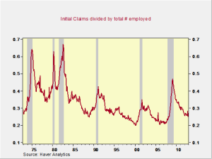
Although this makes for good entertainment, it does little to address the big picture. In order to draw some actual conclusions about how we look against historical norms, we’ve put together the following chart, which shows the number of initial claims for unemployment insurance divided by the total number of employed citizens. When the line moves north, it’s an indication that claims are increasing relative to the number of employed individuals. When it moves lower, it signals an improving employment picture (employment outpacing claims).

Currently, we’re at some of the lowest historical levels in terms of initial claims relative to the number of employed individuals. The prognosticators on CNBC like to compare the initial claims number with historical values in insolation, but, as the chart shows, the number of new claimants represents less than 0.3 percent of the total employment pool. In terms of employment health, this paints a pretty good picture.

Continue reading → Leave a comment

1/15/13 – Employment: Stronger Than You May Think

January 15, 2013

Following on the review of how well the housing market is doing, I thought I would take a look at employment.

Continue reading → Leave a comment

11/14/12 – A Hard Look at Employment: Why the Recovery Will Be Faster than People Think (Part 3)

November 14, 2012

In the last post I talked about why the employment level had to reset and did and about how normal growth in employment appears to have restarted. That alone would argue that employment will come back over time, but there are also other reasons why the employment recovery will be faster than most people expect at this time.

Continue reading → Leave a comment

11/13/12 – A Hard Look at Employment: The Reset (Part 2)

November 13, 2012

In the last post we examined the decline in consumer demand and what it meant for employment, which left us asking: What about the future?

Continue reading → Leave a comment

11/12/12 – A Hard Look at Employment: Setting the Stage (Part 1)

November 12, 2012

I have been spending a great deal of time recently developing an analysis of the U.S. economy, which I presented at Commonwealth’s National Conference. The key issue for everyone is jobs and employment. Why has the recovery been so slow, what can we do to make it better, and when can we expect it to get back to normal?

Continue reading → Leave a comment

10/12/12 – The Two “Uns”: Uncertainty and Unemployment

October 12, 2012

I have been doing some detailed review work on the economy, both historically and going forward, for my presentation at Commonwealth’s upcoming National Conference. As part of that, I put together a chart that I thought was worth sharing as we move closer to the election. The blue line is business uncertainty, and the red line is the U-6 unemployment series. Note how changes in the blue line lead changes in the red line.

Continue reading → Leave a comment

9/26/12 – U.S. Economy: Employment Slows but Housing Keeps Going

September 26, 2012

I want to highlight an interesting chart put together by Pete Essele of Commonwealth’s Asset Management and Research teams. Pete does excellent work in a variety of areas, but he is particularly good at putting together charts and graphics that make important points in very clear ways.

Continue reading → Leave a comment

Lies and Statistics Part 1: Unemployment

June 21, 2012

There is quite a bit of discussion in the press about the U.S. economy, much of which is misguided or misleading. One of the worst offenders is the discussion of unemployment, and I wanted to dig into some of the underlying data to discuss what I look at instead.

Continue reading → Leave a comment

Subscribe via Email

Crash-Test Investing

Hot Topics


New Call-to-action

Conversations

Archives

see all

Subscribe


Disclosure

The information on this website is intended for informational/educational purposes only and should not be construed as investment advice, a solicitation, or a recommendation to buy or sell any security or investment product. Please contact your financial professional for more information specific to your situation.

Certain sections of this commentary contain forward-looking statements that are based on our reasonable expectations, estimates, projections, and assumptions. Forward-looking statements are not guarantees of future performance and involve certain risks and uncertainties, which are difficult to predict. Past performance is not indicative of future results. Diversification does not assure a profit or protect against loss in declining markets.

The S&P 500 Index is a broad-based measurement of changes in stock market conditions based on the average performance of 500 widely held common stocks. All indices are unmanaged and investors cannot invest directly in an index.

The MSCI EAFE (Europe, Australia, Far East) Index is a free float‐adjusted market capitalization index that is designed to measure the equity market performance of developed markets, excluding the U.S. and Canada. The MSCI EAFE Index consists of 21 developed market country indices.

One basis point (bp) is equal to 1/100th of 1 percent, or 0.01 percent.

The VIX (CBOE Volatility Index) measures the market’s expectation of 30-day volatility across a wide range of S&P 500 options.

The forward price-to-earnings (P/E) ratio divides the current share price of the index by its estimated future earnings.

Third-party links are provided to you as a courtesy. We make no representation as to the completeness or accuracy of information provided on these websites. Information on such sites, including third-party links contained within, should not be construed as an endorsement or adoption by Commonwealth of any kind. You should consult with a financial advisor regarding your specific situation.

Member FINRASIPC

Please review our Terms of Use

Commonwealth Financial Network®