 Yesterday, we talked about managing your biases. Today, let’s look at some research tools that can help you do just that.
First, some shameless self-promotion
In my monthly Economic Risk Update and Market Risk Update, I review what I consider to be the most reliable data with respect to the markets and the economy. These analyses are designed to look out over the next year or so, rather than make short-term predictions. Why? Because that's what is achievable. Don’t believe anyone who says they can make those calls reliably over the short term.
GDPNow: “nowcasting” the economy
A good way to prove that point is to look at the Atlanta Fed’s GDPNow. After each major release of economic data, this nifty tool provides an updated estimate of growth for the current quarter. The site refers to itself as a “nowcast” rather than a forecast, and it seems to be about as reliable as the economic consensus, with its rules-based methodology offering a valuable check.
The problem is that the forecast can change dramatically with each data point released. In the past couple of weeks, for example, second-quarter growth was initially forecast at 1.8 percent, dropped to 1.7 percent, then moved up to 2.8 percent, and is now down at 2.5 percent. It can be hard to use a target that moves around that quickly and that much.
This illustrates the value of a data-based tool—the trend over May is clearly toward improving growth—but also the need to be careful about how much you rely on it in the short term. I would argue that, rather than creating predictive models, most investors are better served by deciding which data is meaningful and using that to assemble a big-picture perspective.
Wage Growth Tracker: getting a big-picture view
The Atlanta Fed also does a good job in that regard. Its Wage Growth Tracker tracks wage growth, as you might guess, but it has a couple of features that I find very useful. By updating the figures monthly, using a three-month wage growth average, it removes some of the short-term volatility. And by slicing the data different ways, it allows you to look under the hood a bit to test how robust the overall conclusions are. This is an excellent way to look at meaningful, longer-term trends, as I discussed in a previous post.
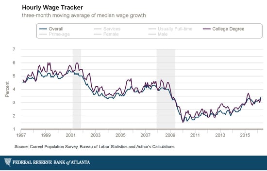
As an example, the chart below shows overall wage growth and wage growth for those with a college degree.

Big-picture, we can see that wage growth continues to grow. In fact, it has accelerated since about 2013 and has nearly reached the level of the mid-2000s. We can also see that wage growth for college grads has not meaningfully exceeded that of non-college grads since 2014. Given many of the current labor market concerns, this is valuable information.
FRED: digging for data
Another excellent (and much more comprehensive) resource is the St. Louis Fed’s FRED database. This free tool rivals many professional programs, and although it requires a bit more work to find what you’re looking for, the data you seek is likely there. If you take an interest in economics, there's really no substitute for digging into the data yourself. Not everyone has the interest, or certainly the time, but it’s useful to know that the information is out there.
Want more? If you’d like to hear about other tools like these, please let me know in the comments, and I’ll plan another post on this topic.


 Print
Print


