Print
Print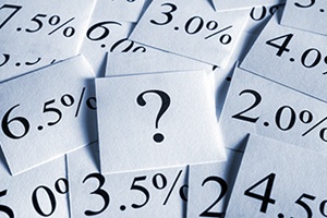 Recently, I have gotten a couple of questions about the inversion of the yield curve, prompted by media coverage. On the theory that one question means one hundred people would like to know, let’s take a look at this important indicator, what it means, and what it doesn’t mean.
Yield curve defined
Let’s start with a definition. The yield curve is simply the different levels of interest rates over different time periods: 1 month, 6 months, 2 years, 5 years, and so on out to 30 years. When you graph them and connect the dots, you get a curve of yields—hence, the term yield curve.
Most of the time, the curve slopes upward. This means that rates for longer time periods are higher than rates for shorter ones. Logically, this makes sense. If you lend for a longer time, you are more at risk, so you should demand to be paid more. In fact, that is how the market normally operates.
Sometimes, though, short-term rates get higher than longer-term rates. This is exactly what an inverted yield curve means: short-term rates are higher than longer-term ones. Depending on what time frames you use, you might get slightly different results. But the usual measures use the rates for 10-year U.S. Treasury debt and either 3-month or 2-year U.S. Treasury debt. It really doesn’t matter what you use; what matters is that the short rate is higher than the long rate.
Trouble ahead?
This inversion can happen for a couple of reasons. But what it means is that investors feel that future growth prospects are relatively low, even though the costs of money in the short term are high. Lower future expectations combined with higher short-term costs can choke the economy and slow growth—and can lead to a recession.
Theoretically, this makes sense. Empirically, it also works, as the yield curve has inverted before each recession in the past several decades. Right now, with long-term rates still low even as short-term rates are rising, we are closer to an inversion than at any time since the last financial crisis. This reliable barometer may be signaling trouble ahead.
From my perspective, the yield curve is indeed a good indicator. In fact, it is one I use every month in the monthly economic risk factor and market risk updates here on the blog. This is something we should be watching, and we are indeed getting close to the trouble zone.
Where we are right now
We are not, however, there yet, and it will likely be some time until we are. If the Fed follows through on its expected rate increases and longer-term rates remain steady, then we should see an inversion toward the end of this year. That sounds worrying. But, historically, once the yield curve does invert, there is typically a lag of 12 to 18 months until the economy actually turns down. In other words, from where we are right now, we probably have another 18 months or so, maybe more. Trouble may be on the way, but it will not arrive until next year and maybe later.
The big picture
Bigger picture, the yield curve is also consistent with other indicators that both make theoretical sense and actually work. All are signaling continued growth. While there has been some weakness, there is also a significant amount of running room before they decay to the trouble zone, just like the yield curve.
As I said, this is an indicator I track monthly. So, if you are concerned (and you shouldn’t be, yet), check back here early next month (and every month) to see exactly where we are on this and other reliable indicators.