Print
Print My colleague Sam Millette, manager, fixed income on Commonwealth’s Investment Management and Research team, has helped me put together this month’s Market Risk Update. Thanks for the assist, Sam!
After a difficult September, markets bounced back strongly in October. Here in the U.S., all three major indices were up significantly, with the Nasdaq and the S&P 500 gaining more than 7 percent and the Dow rising almost 6 percent. Developed markets showed a smaller gain, at almost 2.5 percent, and emerging markets eked out a 1 percent gain. While stocks did well, bonds had another bad month, dropping slightly as interest rates rose. Will those gains continue? Let’s take a look at the risks.
Recession Risk
Recessions are strongly associated with market drawdowns; in fact, 8 of 10 bear markets have occurred during recessions. The National Bureau of Economic Research, which declared that a recession started last February when markets plunged, recently announced that it ended shortly thereafter. Despite that and the ongoing expansion, economic risks remain. The primary risk is a slowing recovery, as evidenced by a slowdown in job growth and a drop in consumer confidence in September.
On the whole, the economic recovery continues, with some acceleration seen in October. But given the remaining risks, we have kept the economic risk level at a yellow light for now. Although the most likely path forward is continued recovery, the decrease in economic activity in September signals that the economic risk is still material despite October’s improvement.
Economic Shock Risk
One major systemic factor is the price of money, otherwise known as interest rates. They drive the economy and financial markets—and, historically, have been able to derail them. Rates have been causal factors in previous bear markets and deserve close attention.
Risk factor #1: The yield curve (10-year minus 3-month Treasury rates). We cover interest rates in the economic update, but they warrant a look here as well.
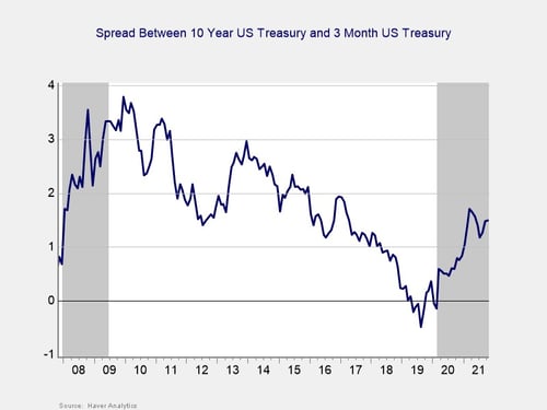
The yield curve steepened in October for the third consecutive month. This result was primarily due to rising long-term interest rates, as the 10-year Treasury yield increased from 1.52 percent at the end of September to 1.59 percent at the end of October. The three-month Treasury yield rose from 0.04 percent at the end of September to 0.06 percent at the end of October. Although short-term rates are expected to remain low until at least 2023, longer-term rates rose during the month—partially in response to the Fed’s September meeting, at which the central bank indicated it may start tapering asset purchases by the end of the year. This increase brought long-term yields closer to pre-pandemic levels and the recent highs we saw in March and April of this year.
Although the rise in long-term yields during the month is a sign of a return to more historically normal yield levels, the rising yields do pose a threat for equity valuations, as we saw in September (and earlier in the year, when rising long-term yields contributed to equity market volatility).
Given that long-term yields are approaching 2021 highs, we have kept this indicator at a yellow light.
Signal: Yellow light
Market Risk
Beyond the economy, we can also learn quite a bit by examining the market itself. For our purposes, two things are important:
- To recognize which factors signal high risk
- To try to determine when those factors signal that the risk has become an immediate—rather than theoretical—concern
Risk factor #1: Valuation levels. When assessing valuations, we find longer-term metrics (particularly the cyclically adjusted Shiller P/E or price-to-earnings ratio, which looks at average earnings over the past 10 years) to be the most useful in determining overall risk.
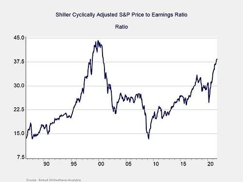
Please note: Because of data limitations, this is the same chart that was used in last month’s update.
Valuations continued to rise in September, as the Shiller CAPE ratio rose from 38.09 in August to 38.34 in September. This marks four consecutive months with rising equity market valuations, and it left the ratio at its highest level since late 2000.
Even though the Shiller CAPE ratio is a good risk indicator, it’s a terrible timing indicator. To get a better sense of immediate risk, let’s turn to the 10-month change in valuations. Looking at changes rather than absolute levels gives a sense of the immediate risk level because turning points often coincide with changes in market trends.
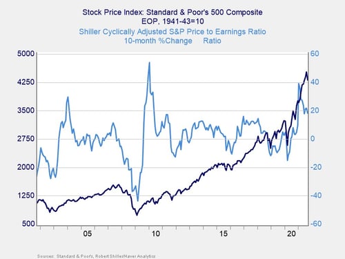
Above, you can see that when valuations roll over—with the change dropping below zero over a 10-month or 200-day period—the market itself typically drops shortly thereafter. This relationship was held at the start of the pandemic, as valuations and the index rolled over before rebounding. On a 10-month basis, valuations rose 18.1 percent in September, down from the 21.8 percent increase we saw in August. Given the historically high valuation levels, we have kept this indicator as a yellow light for now, despite the fact that valuation changes have remained outside the danger zone since May 2020.
Signal: Yellow light
Risk factor #2: Margin debt. Another indicator of potential trouble is margin debt.
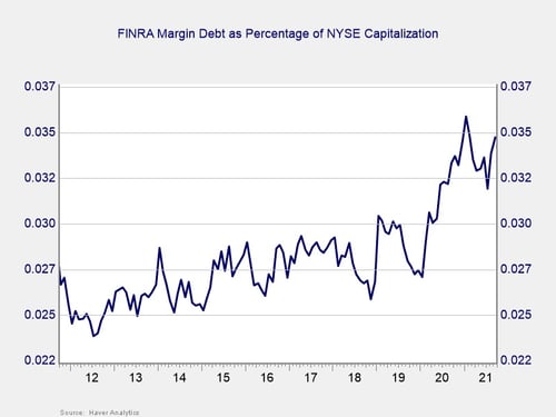
Debt levels as a percentage of market capitalization increased notably at the start of the pandemic and throughout 2020. Since then, we have seen margin debt first decline but more recently rebound as a percentage of market capitalization. Margin debt increased in August and September, and the overall level of margin debt remains high on a historical basis. The high level of debt associated with the market is a risk factor on its own but not necessarily an immediate one.
For immediate risk, changes in margin debt over a longer period are a better indicator than the level of that debt. Consistent with this, if we look at the change over time, spikes in debt levels typically precede a drawdown.
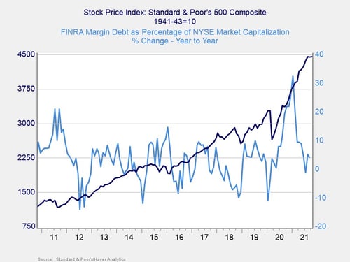
Please note: Margin debt increased 4.15 percent year-over-year in September.
As you can see in the chart above, margin debt as a percentage of market capitalization increased by 5.2 percent in August after a 1.2 percent decline in July. Despite this increase, the year-over-year growth rate remains well below the recent high of 32.5 percent we saw in January.
Although the year-over-year growth figure remains below highs from earlier in the year, the increasing margin debt as a percentage of market capitalization is worth monitoring, given the historically high level of margin debt. We have kept this indicator at a yellow light for now.
Signal: Yellow light
Risk factor #3: Technical factors. A good way to track overall market trends is to review the current level versus recent performance. Two metrics we follow are the 200-day and 400-day moving averages. We start to pay attention when a market breaks through its 200-day average, and a breakthrough of the 400-day average often signals further trouble ahead.
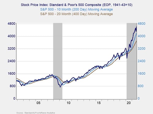
Technical factors remained supportive for equity markets throughout October. The S&P 500, which managed to break above its 200-day moving average at the end of May 2020, has finished above trend every month since. The Dow Jones Industrial Average and Nasdaq Composite have seen similar technical support. This marks 16 consecutive months with all three major U.S. indices finishing above trend.
The 200-day trend line is an important technical signal that is widely followed by market participants, as prolonged breaks above or below could indicate a longer-term shift in investor sentiment for an index. The 400-day trend line is also a reliable indicator of a change in trend. The continued technical support for markets despite volatility during the month was encouraging, so we have left this signal at a green light.
Signal: Green light
Risk factor #4: Market complacency. This is a recently added risk factor that aims to capture a standardized measure of market complacency across time. Complacency can be an uncertain term, so this chart identifies and combines two common ways to measure complacency: valuations and volatility.
For the valuation component of the index, we are using the forward-looking price-to-earnings ratio for the S&P 500 over the next 12 months. This gives an idea of how much investors are willing to pay for companies based on their anticipated earnings. Typically, when valuations are high, it signals investors are confident and potentially complacent. For volatility, we have used the monthly average level for the VIX, a stock market volatility index. When volatility for the S&P 500 is high, the VIX rises, which would signal less complacency.
By combining the two metrics in the chart below, we see periods where high valuations and low volatility have caused peaks, such as 2000, 2006–2007, and 2017. We saw market drawdowns within roughly one year following each of these peaks.
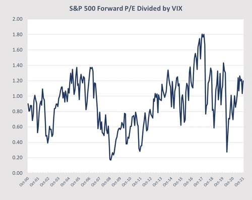
Source: Haver Analytics, FactSet
Please note: In October, the VIX averaged 17.87, the forward-looking P/E ratio was 21.4, and the index value was 1.2.
Looking at the current chart, market complacency rose again in October. The average VIX reading decreased from 19.8 in September to 17.9. The forward-looking P/E ratio for the S&P 500, on the other hand, rose from 20.5 to 21.3 during the month. The combination of lower volatility and higher forward-looking valuations caused the market complacency index to rise back to 1.2, returning the index to recent highs.
Readings exceeding 1.2 have historically been a signal that market complacency may be at concerning levels; with the index is back at this level, it’s a potential signal of caution. We have reverted this indicator to a yellow light to reflect the change.
Signal: Yellow light
Conclusion: October Recovery, but Risks Persist
Economic fundamentals showed a substantial improvement in October, reducing economic market risks. We saw employment data improve markedly as consumer confidence stabilized, which is a good sign for future spending growth. It should be noted that, though the pace of the economic recovery improved, medical and economic risks are still material.
Markets bounced significantly during October on the improved data, reaching new highs. Investor worries subsided on better medical and economic news, despite remaining concerns around supply chains and inflation. Given that recovery and improved fundamentals, a continued market recovery remains the most likely path forward.
Ultimately, the path back to a more normal economic environment will likely be long, and we can expect setbacks along the way (as we saw in September). Given that the indicators we track in this update remained at a yellow light or better during the month, we have left the overall market risk level at a yellow light for now, but the recent slowdown in medical improvement could lead to further volatility and downgrades in the months ahead.