Print
Print My colleague Sam Millette, senior investment research analyst on Commonwealth’s Investment Management and Research team, has helped me put together this month’s Market Risk Update. Thanks for the assist, Sam!!
Markets rebounded in November, as positive news on the vaccine caused markets to surge. The S&P 500 gained 10.95 percent during the month, while the Nasdaq Composite rose by 11.91 percent and the Dow Jones Industrial Average by 12.14 percent. These strong results helped break a streak of two consecutive months with declining equity markets, and all three indices set new all-time highs. Despite the strong returns in November, however, markets still face very real risks, as we discuss below.
Recession Risk
Recessions are strongly associated with market drawdowns. Indeed, 8 of 10 bear markets have occurred during recessions. As we discussed in this month’s Economic Risk Factor Update, the National Bureau of Economic Research (NBER) declared that a recession started in February. On top of that, several of the major economic indicators we cover monthly remain at concerning levels, despite continued economic recovery during the month. As such, we have kept the economic factors at a red light for December.
Economic Shock Risk
Please note: We have removed the oil price chart from this piece to more closely focus on market-related risks factors going forward.
One of the factors we track in the economic update is the price of money, otherwise known as interest rates. This is a systemic factor that drives the economy and financial markets and has historically had the ability to derail them. Rates have been causal factors in previous bear markets and deserve close attention.
Risk factor #1: The yield curve (10-year minus 3-month Treasury rates). We cover interest rates in the economic update, but they warrant a look here as well.
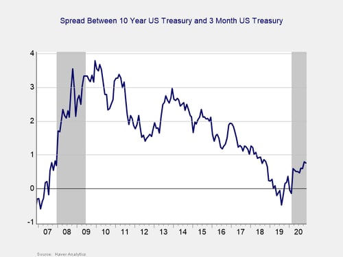
The yield curve started the year inverted, and it un-inverted in March, where it has remained throughout the pandemic. This un-inversion was driven by a sharp drop in short-term rates, caused by the Fed’s decision to cut the federal funds rate to effectively 0 percent in March. The 3-month Treasury yield fell modestly in November, from 0.09 percent at the start of the month to 0.08 percent at month-end. The 10-year yield also fell from 0.88 percent at the end of October to 0.84 percent at the end of November.
Although an inversion is a good signal of a pending recession, it’s when the gap subsequently approaches 75 bps or more that a recession is likely. We finished November with a spread of 76 bps, and the NBER declared a recession started in February. In light of that, and with the spread remaining at the critical level, we are leaving this indicator at a red light.
Signal: Red light
Market Risk
Beyond the economy, we can also learn quite a bit by examining the market itself. For our purposes, two things are important:
- To recognize what factors signal high risk
- To try to determine when those factors signal that risk has become an immediate, rather than theoretical, concern
Risk factor #1: Valuation levels. When it comes to assessing valuations, we find longer-term metrics—particularly the cyclically adjusted Shiller P/E ratio, which looks at average earnings over the past 10 years—to be the most useful in determining overall risk.
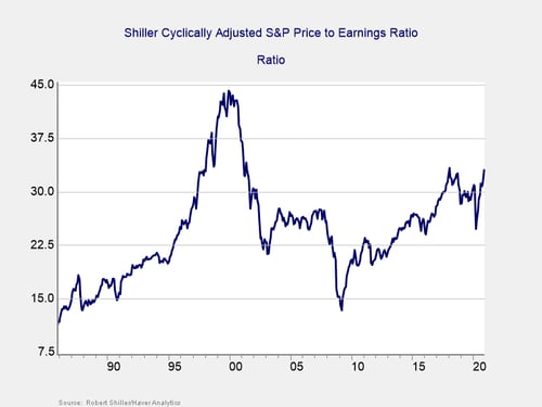
Valuations continued to rise in November, with the S&P rally bringing the Shiller CAPE ratio up from 31.2 in October to 33.1 in November. This brings valuations to their second-highest level since the dot-com bubble, only modestly behind the 33.3 high-water mark that was set in January 2018.
Even as the Shiller P/E ratio is a good risk indicator, it is a terrible timing indicator. To get a better sense of immediate risk, we can turn to the 10-month change in valuations. Looking at changes, rather than absolute levels, gives a sense of the immediate risk level, as turning points often coincide with changes in market trends.
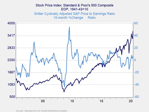
Here, you can see that when valuations roll over, with the change dropping below zero over a 10-month or 200-day period, the market itself typically drops shortly thereafter. This relationship held in March, as valuations and the index both rolled over before rebounding. On a 10-month basis, valuations rose by 6.7 percent in November, up from a 2.9 percent increase in October. Given the historically high valuation levels, we have kept this indicator as a yellow light for now, even though changes in valuations have remained outside the danger zone for the past six months.
Signal: Yellow light
Risk factor #2: Margin debt. Another indicator of potential trouble is margin debt.
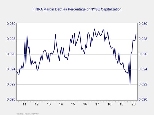
Debt levels as a percentage of market capitalization had dropped substantially over the past two years before spiking in February to a then six-month high. March saw this measure of market debt fall to levels last seen in 2010, as investors de-risked, before rebounding notably along with the market. With the rebound, margin debt as a percentage of market capitalization rose in the summer and reached a new high in September, climbing to levels last seen in May 2018.
For immediate risk, changes in margin debt over a longer period are a better indicator than the level of that debt. Consistent with this, if we look at the change over time, spikes in debt levels typically precede a drawdown.
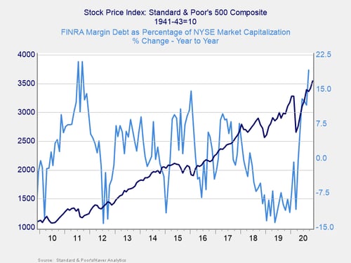
As you can see in the chart above, the annual change in debt as a percentage of market capitalization increased in February, before falling steeply in March and increasing sharply once lockdowns ended.
September’s debt level increased by 19.2 percent on a year-over-year basis, up from a 11.6 percent increase in August, which indicates that risks are rising. This marks the largest increase in margin debt since September 2011, when year-over-year debt levels increased by 21 percent. Given the increase in debt on both a monthly and yearly basis, and the fact that the overall debt level remains historically high, this risk is rising, and we have kept this indicator at a red light for now.
Signal: Red light
Risk factor #3: Technical factors. A good way to track overall market trends is to review the current level versus recent performance. Two metrics we follow are the 200-day and 400-day moving averages. We start to pay attention when a market breaks through its 200-day average, and a break through the 400-day often signals further trouble ahead.
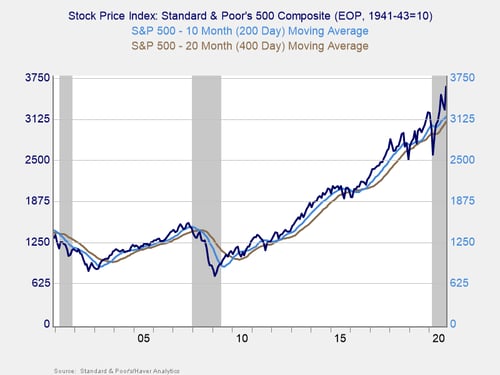
Technical factors remained supportive for equity markets in November. The S&P 500, which managed to break above its 200-day moving average at the end of May, finished above trend for the seventh month in a row. This also marks five straight months with all three major indices finishing above trend.
The 200-day trend line is an important technical signal that is widely followed by market participants, as prolonged breaks above or below this trend line could indicate a longer-term shift in investor sentiment for an index. The 400-day trend line is also a reliable indicator of a change in trend. The continued technical support for markets in November was encouraging, so we have left this signal at a green light for the month.
Signal: Green light
Risk factor #4: Market complacency. This is a recently added risk factor that aims to capture a standardized measure of market complacency across time. Complacency can be an uncertain term, so this chart aims to identify and combine two of the common ways to measure complacency: valuations and volatility.
For the valuation component of the index, we are using the forward-looking price-to-earnings ratio for the S&P 500 over the next 12 months. This gives an idea of how much investors are willing to pay for companies based on their anticipated earnings. Typically, when valuations are high, it signals that investors are confident and potentially complacent. For volatility, we have used the monthly average level for the VIX, a stock market volatility index. When volatility for the S&P 500 is high, the VIX rises, which would signal less complacency.
By combining the two metrics in the chart below, we see periods where high valuations and low volatility have caused peaks, such as 2000, 2006 to 2007, and 2017. We saw market drawdowns roughly within a year following each of these peaks.
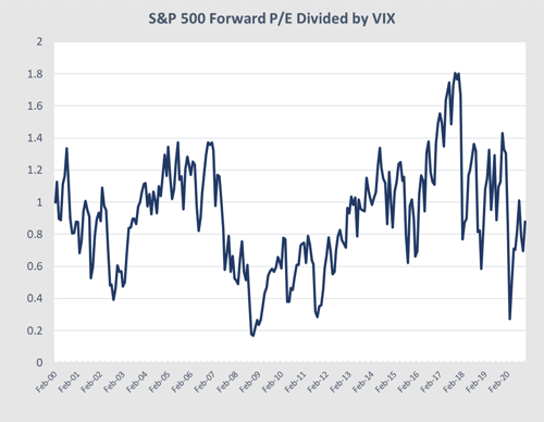
Looking at the current market, it appears as if complacency is not that high right now. While valuations have rebounded along with the market, there has been enough volatility to cause the VIX to rise and take the overall index lower compared to earlier in the year. The rebound in markets in November caused valuations to rise and the VIX to fall, but November’s average VIX of 25 is still higher than the recent low of 22.9 that we saw in August. The index’s current level of 0.88 is well below the 1.2 level that has historically shown high levels of complacency in the market.
We are keeping this indicator at a green light due to the fact that the index still sits below the historical trouble level and that the VIX remains above the recent lows despite the rally in November.
Signal: Green light
Conclusion: Market Risks Remain Despite Rebound in November
Economic fundamentals showed continued growth in November, but the pace of the recovery slowed compared to earlier in the year. Markets cheered the better-than-expected vaccine news released during the month, breaking a streak of two consecutive months with market declines and bringing all three major indices to new all-time highs. Despite the good news on the vaccine front, cases continued to rise in November, and the pandemic represents a very real risk for the economic recovery and markets over the next few months.
Given the continued risk posed by the pandemic and indicators of stress in the market statistics themselves, we are keeping the overall market risk indicator at a red light for now. This is not a sign that markets are necessarily headed back to the lows. Instead, it is a recognition that the road back to normal is likely going to be long, with the potential for setbacks that could lead to additional market pullbacks. Given the uncertainty created by the pandemic and the possibility for further volatility, investors should remain cautious on equity markets.