Print
Print Brad here. Today, we have a detailed look at what an inverted yield curve might mean for bonds from one of our great investment analysts, Nicholas Follett. Enjoy!
Here on the blog, Brad has discussed how an inverted yield curve is often a harbinger of a recession followed by a market sell-off. But what does an inverted yield curve mean for bonds, which are supposed to be the “safe” component in your portfolio? Specifically, how do they act before, during, and after the yield curve upends itself? Let’s take a closer look.
What happens during a recession?
Before a recession, the equity market generally moves right along. Since 1980, the S&P has been up 8.2 percent, on average, in the year before a recession. Meanwhile, in the trailing 12 months after a recession, stocks usually exhibit virtually flat performance. In the pre-recession phase, it would seem to make sense to use risk assets like high-yield, rather than safer intermediate-term strategies that would be beneficial after a recession. During a recession (the average length being 15 months), investors hope to see their bonds act as a ballast against falling stocks. So, what if we could determine how stocks did, how bonds did, and whether there is a preferred allocation during these time frames?
To help answer these questions, I first determined a time frame to test. To keep it simple, I used the 12 months before an inversion (defined by a negative 10–2 spread) and the 12 months after. Then, I annualized the time during the inversion to get the best apples-to-apples comparison.
Benchmark return test: Which part of the curve is most affected?
In the broadest sense, the first test was to determine which part of the yield curve is most affected by an inversion. To remove specific fund performance and manager talent from the equation, I used the Bloomberg Barclays U.S. Government and the Bloomberg Barclays U.S. Government/Credit indices for short-, intermediate-, and long-term portions of the curve.
The U.S. government indices are mostly U.S. Treasuries. The government/credit indices add a 50 percent allocation to investment-grade corporate bonds.
Benchmark returns before, during, and after inversion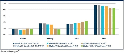
The first thing to note in the chart above is that the bonds did their job and held up: all three periods were positive. The addition of the credit component to the benchmark did little to affect the return. The government/credit indices outperformed the government-only indices by about 25 bps over the full 36 months of the observation period.
Before inversion: No change in maturity performance. Before the curve inverts, it flattens (i.e., the long end falls relative to the short end). On average, the three maturities in our test behaved roughly the same over the preceding year. Conceptually, this behavior makes sense. At this point, the curve would be flat, and bonds across the maturity spectrum would have the same yield.
Short performed best during inversion. Once the curve inverted, the short end had the best performance, with the longer indices lagging. This trend reversed once the curve normalized. This performance, too, makes sense. The curve is inverted when shorter-maturity bonds yield more than longer-dated paper; therefore, investing in the highest yield would achieve the highest return. Over the full course of the inversion cycle, the short-term holdings returned 24 percent; the intermediate- and long-term holdings returned 23 percent and 21 percent, respectively. But what we are most interested in is whether they would offset the equity sell-off. The answer? A resounding yes.
Now that we know, on the most basic level, that our bond portfolio helps returns, is there a best sector to be in?
Category returns test: How did Morningstar® maturity categories do?
Of course, you can’t invest directly in benchmarks. To explore whether a more diversified approach would produce higher returns, I used the Morningstar short, intermediate, and long categories. I also added spread categories: multisector, high-yield, and bank loans. This approach introduced credit risk and manager ability, although manager ability was somewhat muted by using the entire category.
As you can see in the chart below, short again outperformed long during the inversion, at 24 percent. Long was the best performer overall for the term sectors. Short and intermediate returned 22 percent and 23 percent, respectively.
Category returns before, during, and after inversion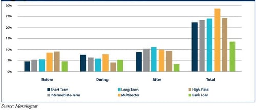
Spread sectors fared differently. Multisector—with its flexibility in terms of duration and asset allocation that would benefit in different yield environments—was consistently among the top performers. It returned 5 percent more than any other category during the 36-month campaign. Despite its typical quarterly resets and low duration, the bank loan category couldn’t capitalize on higher front-end rates. It produced the lowest return among the six categories tested.
Quality outperformed. One main takeaway from this test, however, is that all three quality holdings—short, intermediate, and long—performed nearly as well as high-yield and far better than bank loans with less volatility. This was another indication that, in fixed income investing, interest rate sensitivity (measured as duration) isn’t the only major risk. We also need to be cognizant of credit risk. Because inversions precede recessions—in which lower-quality credit sectors typically struggle—the introduction of a negative 10–2 spread can be a signal to move up in quality along a fixed income portfolio.
What have we learned?
Should we shorten up duration and load up on unconstrained funds in the face of an inverted yield curve? To judge the effect of curve positioning, I cherry-picked the best- and worst-possible performers in the fund category test to determine what the difference in return would be. What is the difference between being exactly right and exactly wrong?
If choosing correctly, an investor would hold long-term funds when the spread is tightening, short-term funds during an inversion, and long-term funds once the curve started to steepen again (i.e., after a positive-sloping curve had been reestablished). The successful investor’s return would be 25 percent over three years. If choosing incorrectly, the return would be 20 percent. If bought and held, all three maturity-based categories would be less than 3 percent away from the “perfect allocation.” There’s little point in trying to time the market.
Balance and diversity are key
The shape of the yield curve is something we need to be aware of. But during an inversion, even the worst curve positioning yields a positive return and isn’t as detrimental a component in fixed income investing as we have been led to believe. As always, it’s important to be a balanced and diversified investor. And this time around, it won’t be any different.