Print
Print As we negotiate the recession or no recession debate, one of the key data points is what’s called a yield curve inversion, which is a greatly intimidating technical term for something that is really pretty simple: the interest rate on a long-term bond minus the interest rate on a short-term bond. But economists can’t really be intimidating if we just say that!
The idea behind it is similarly simple, which is that lending money for longer is riskier than lending money for shorter because more can go wrong. So, interest rates (i.e., the price borrowers pay to compensate the lenders for risk) should be higher for longer periods. If they are not, then something is wrong. What is usually wrong is that those investors see a recession coming soon, within that short term, and want to be paid for that risk.
Where Are We Today?
Short-term interest rates are higher than long-term rates, so that is interpreted as a sign of a pending recession. It has generated any number of headlines, talking about inversions, recessions, and how we should all panic.
Personally, I am not panicking and am not even very concerned—yet. Because even though the concept is pretty simple, using that idea to predict the future is much less straightforward. For example, which short-term rates and which long-term rates? It makes a difference.
For long term, pretty much everyone uses the 10-year U.S. Treasury. But for the short term, there are two different options: the two-year U.S. Treasury and the three-month U.S. Treasury. And they often give different results, like in the past year or so, for example.
Which Indicator Is Right?
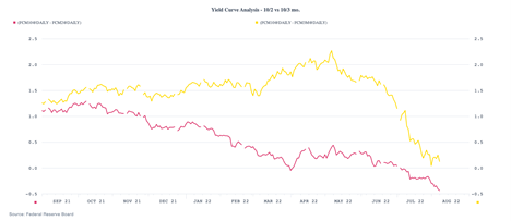
The 10-year/2-year differential (the difference between the 10-year Treasury rate and the 2-year Treasury rate) has been steadily deteriorating all year, turned briefly negative in March-April, and has been consistently negative since the start of July. It certainly looks like a recession signal. But the 10-year/3-month differential held up strongly through June and, even after a sharp drop in July, is still positive and may be stabilizing. The first is telling us the recession is pretty much certain, while the second is saying the risks are rising—but we are not there yet. Which is right?
If we go back in history, we can see this pattern has played out before. The 10/2 curve, shown as red below, tends to go negative first, often for several months, followed by the 10/3 curve. As such, they are both good indicators, but the 10/3 curve is significantly more timely. We saw that in 1999-2000 and in 2006–2009. In both cases, the 10/2 went negative well more than a year before the actual recession kicked in. The 10/3 curve, on the other hand, in both cases bottomed out and then rebounded about 6 to 12 months before the start of the recession. While 2020 was somewhat different, that is largely due to the policy nature of that recession—and it wasn’t that different.
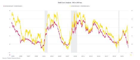
If you think about it, the greater timeliness of the 10/3 curve makes sense. If an inversion means that investors are pricing in a recession over the holding period for the bond, the 10/2 curve includes the next two years, while the 10/3 curve only includes the next three months. You would expect the second to be more timely, and that is just what we see. The 10/2 curve says a recession in the next two years, but the 10/3 curve still says no recession in at least the next three months.
What Does This Mean for Today?
The 10/2 indicator has gone off and is saying there will be a recession in the next two years or so. Fair enough, given the deterioration in the data. But the 10/3 indicator has not gone off, which says no recession for the next six months or so. Again, fair enough, especially given the strength of hiring.
Looking beyond the yield curves, the recession risks in the short term don’t appear to be that high, given the strength of some data and the stabilization or improvement of others. Over the next year or so, however, the risks are definitely there—and higher than they were.
What Do We Need to Watch?
In all cases in the past 30 years, the 10/2 curve bounced back up before the recession, so watch for that. In all cases, the 10/3 curve did the same, so watch for that. For the first, that started the clock ticking with a one- to two-year period, while for the second it starts a 6- to 12-month clock. But so far, in neither case has the alarm actually gone off.
No Alarm Bells Yet
Because of that, I am not getting up just yet. We know that the alarm will ring at some point, but we still have some time. When you look at the other data, that is confirmed, with strong hiring, decent business investment, and stabilizing confidence. The alarm will go off at some point, but what the yield curves are telling us is that we still have a ways to go.