 Today I’m going to discuss one of the major concerns out there: wage growth. Specifically, is what we’re seeing in terms of wage growth real or imaginary?
Let’s start with the chart below, where you can see wage growth ran at about 2 percent per year from 2011 through 2015 and then started to grow, until recently. Looking at this chart, you could conclude that the recovery really began to help the average worker at the start of 2015—and that things might be starting to change.
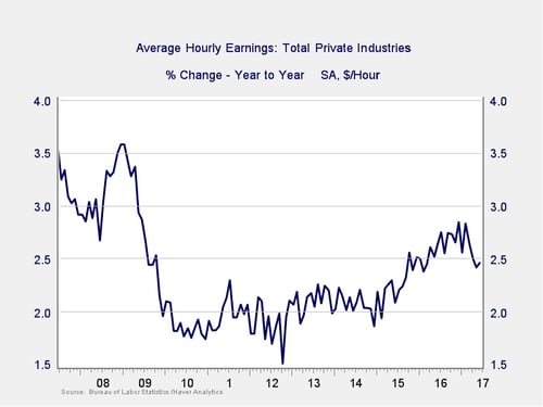
This chart is a bit misleading, though, in that it covers only the past 10 years. So, let’s look at a longer period in the next chart, extending back to the past 40 years. It presents a slightly different data set, including only production and nonsupervisory workers, which is probably a better proxy for the average person.
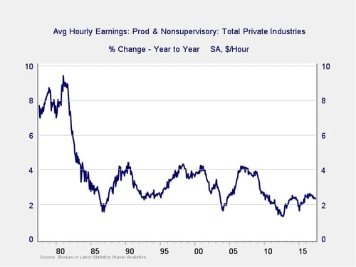
According to this chart, wage growth is still pretty terrible. Although it has recovered a bit, it remains at the bottom of the range. Further, there’s no sign of growth moving back up to the 4-percent range of the past 30 years and no hope of achieving the 8-percent range of the late 1970s.
Again, however, this chart is misleading in that it is in nominal dollars and does not include the effects of inflation. Higher wages, if matched with higher prices, don’t really improve a worker’s standard of living. A better tool is to adjust the wage level for the effects of inflation to determine the real change in wages and, consequently, the real change in a worker’s purchasing power. This is illustrated in the chart below.
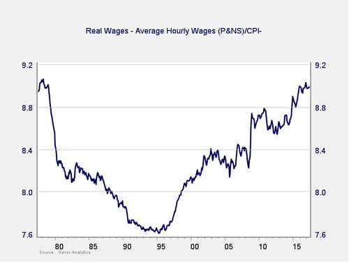
By adjusting the average wage for inflation, we can see that real wages actually declined through the 1980s and early 1990s. They started to grow again in the late 1990s and continued, with pauses, in the mid-2000s and early 2010s, to the point where real wage purchasing power is just now approaching the level of 1980.
Looking at the annual percentage changes below, you can clearly see the negative trend through the 1980s, as inflation eroded purchasing power, as well as the gains in the 1990s and 2000 as inflation subsided. In this context, wage growth in recent years has actually been pretty good—approaching 2.5 percent—which is the highest we have seen over that time period. The recent pullback puts that into question, of course, but the recovery overall has not been that bad.
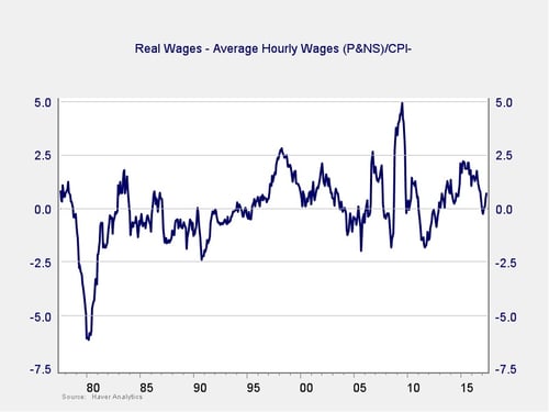
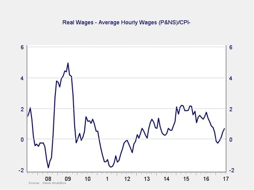
In fact, if we take that chart and look at only the last 10 years, as shown below, we see that real wage growth was accelerating from after the 2011 Greek financial panic to until about 18 months ago. It then pulled back over the next 12 months but has since risen for about the past 6 months.
What’s the takeaway?
The takeaway here is that, despite a very real pullback, we have seen substantial increases in purchasing power for the average worker since 2013. Moreover, that increase looks likely to continue based on the most recent data.
There are real concerns about the low level of price inflation, but one very positive effect is that even low nominal levels of wage growth are actually quite effective in raising workers’ purchasing power. Psychologically, low wage growth remains damaging, which probably explains some of the weak spending data. Functionally, however, conditions are better than they have been in years—and may continue to improve even more.
As always, adding some historical context and really thinking about what a data set means allow us to both understand and act more effectively than the headline data alone would do. Given this data, the long expansion of the economy—and rise in the stock market—makes a lot more sense.


 Print
Print


