Print
Print On the face of it, this morning’s strong jobs number should elicit a full three cheers. Job growth came in at 263,000. This result was up from last month’s downwardly revised 189,000 and well above the expected 190,000. Looks like a home run, right? In fact, when you dig into the details, the news (while still good) is not nearly as good as the headline suggests. That is why I am subtracting a full cheer from the headline.
A tale of two surveys
To understand why that is, we need to dig into the weeds a bit on how the employment statistics are gathered. There are actually two surveys. The establishment survey takes data from businesses and is the one that is the basis for the job growth numbers. The household survey, no surprise, surveys households and is the source of the unemployment stats. In theory, they should be the same. Every worker has to come from a household, after all. In fact, they differ for multiple reasons, some good and some bad. This is a case where that difference may start to make a difference.
In the chart below, the light blue line is from the establishment survey. You can see that it shows consistent growth of just under 2 percent on a year-to-year basis. The household survey, the dark blue line, is much more variable, ranging from 0-percent growth to almost 3 percent over the same time period. Nonetheless, they do generally move in line with each other, and trends in one are mirrored in the other. Until recently.
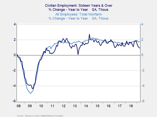
If you look at the trend in the establishment survey, it is up with a blip down in the past couple of months. The household survey, on the other hand, has switched to a negative trend over that same time period, widening the gap. The most recent couple of months have been the worst of all.
The unemployment rate
We can see the same gap between the strong headline data and weaker fundamentals within data from the household survey itself. The unemployment rate, for example, just dropped to 3.6 percent, the lowest since 1969—almost 50 years. That has to be good, right? It is, but it is also worth taking a look at why it has dropped so low.
The answer comes from how the number is calculated, which is by taking the employment reported in the household survey and dividing it by the labor force. In this case, the number of people employed dropped, by 103,000, which is bad. But this decline was offset by a bigger drop in the size of the labor force, by 490,000, which is also bad. In other words, we got a great number from two bad ones—and that’s not good.
The average workweek
There are other reasons to think the headline number is not as good as it looks. The average workweek declined, from 34.5 hours to 34.4 hours, which doesn’t seem like a big deal. But that reduced overall labor demand by the equivalent of tens of thousands of jobs. The participation rate has declined, from 63 percent to 62.9 percent, which means people are choosing to leave the labor force. Again, not a good thing.
Is weakness on its way?
None of this is to say the very strong headline number is a bad thing. It isn’t, and it still signals continued growth for the economy as a whole. Much like the first-quarter GDP number, however, that strong result is not as good when we look under the surface and suggests weakness may be on its way.
For the moment, though, things continue to look good. And, we have seen weakness like this before in this recovery, only to see the data recover. The discussion here is a sign of caution, not necessarily the end of the expansion.
So, let’s give those two cheers for now—and hope the underlying data improves so we can give the third later.