Print
Print Yesterday’s market drop reversed all of Monday’s gain and then some, reportedly on growing doubts regarding the exact terms of the trade war truce announced by President Trump. That might be the case, but I suspect the headlines pointing out that part of the yield curve had inverted played a bigger role in the decline. This inversion is usually a sign of economic trouble, so it would make sense for the market to pull back. The problem is that, while technically true, the inversion we saw typically indicates that trouble will show up in a couple of years—if it does at all. If the market was reacting to the inversion, it was overreacting.
What is a yield curve inversion?
As a reminder, the yield curve simply means the difference between the interest rates charged for different time periods. You would expect to pay more for a 30-year mortgage than for a 10-year mortgage, for example, and that is normally the case. Sometimes, though, the combination of rising short-term rates (usually driven by rate increases by the Fed) and declining longer-term rates (driven by pessimism about growth) pushes shorter rates higher than longer-term ones. This is called an inversion of the yield curve.
Sign of trouble ahead?
As you can see in the chart below, if it costs more to borrow for shorter, something must be out of whack. That is why, historically, an inverted yield curve has been a good sign of economic trouble ahead. It is also why the stock market would tank—fear of an economic recession.
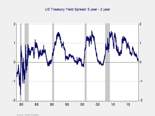
The problem? Although an inverted yield curve is a good indicator of trouble, it has never been a good sign of immediate trouble. For the particular inversion we are seeing, as shown in the chart above, there has typically been a delay of two years or more between the initial inversion and the actual recession. This indicator is a yellow light, telling us something that we actually already know (i.e., that the economy is slowing) and not a red light announcing imminent trouble.
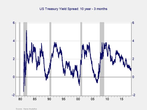
Yield curve (10-year minus 3-month Treasury rates): a timely indicator
If we want to look at the yield curve as an economic indicator, a more timely indicator is the spread between the 10-year and 3-month rates, as shown in the chart below. This is the indicator I use in the monthly Economic Risk Factor Update. The reason I use this one specifically is that it is the most timely, with about a one-year delay. Note, however, that this spread has not yet inverted. As such, we likely have longer than that before market trouble. Once again, a yellow light even when it actually inverts—and it hasn’t yet.
One thing that has kept markets moving up until recently has been the steady if slow growth of the economy. The fear now is that when the economy declines, so will the market. Any signs of economic trouble are therefore doubly damaging to the market: not only to the fundamentals but also to confidence. That is what we are seeing right now.
Recession ahead?
That fear is reasonable. After all, bear markets are typically associated with recessions, so watching for a recession makes sense. Someday, we will indeed have one—very likely with the associated bear market.
Right now, though, the signs simply don’t seem to be there. The economy is slowing, but it is still growing. Although corporate earnings growth will likely moderate next year, expectations are that it will still be strong. Valuations are expensive by historical standards, but they are cheap by recent history. In other words, things are not as good as they were—but they are still not bad at all.
You can see this in the performance of markets during the most recent downturn, including yesterday’s decline. Depending on how you measure it, we either just avoided or barely edged into a correction earlier in the pullback, before recovering some of the losses. This is normal. The current further pullback is also normal. As I write this (December 4, 2018), the S&P 500 is down about 7 percent, or half of the decline we see in a typical year. It could get worse again without signifying a sustained bear market.
Economic fundamentals remain solid
Market volatility is scary. It could continue or get worse. Even if it does, though, what we are seeing is still normal and nothing to worry about yet. While some lights are flashing yellow, most (e.g., job growth, confidence, and even most of the yield curve) are still green. With the economic fundamentals solid, any further volatility will likely be limited.
Keep calm and carry on.