 For well over a year, I’ve been saying that job growth is not quite in a boom, but you can see one from here. After all that time, I think that we’ve largely arrived.
I was talking yesterday with an advisor who mentioned that when he goes to hire, he has been astonished by the salaries young, inexperienced workers are asking for—and, in many cases, getting. To me, this sounded a lot like the late 1990s, the last real employment boom we had here in the U.S.
Have we actually returned to boom times? Data junkie that I am, I decided to see what the numbers say.
Job creation close to 1990s boom
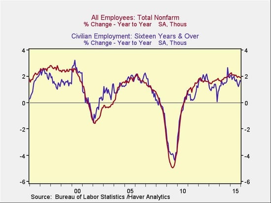
To start off, I looked at the two most inclusive employment surveys: the establishment (business) survey, which is the red line, and the household (personal) survey, which is the blue line.

When you compare current results to the late 1990s, the household numbers are almost identical, and the business numbers are somewhat worse. Note also that both surveys show job growth at about the fastest rate we saw in the mid-2000s. In terms of job creation, if the late 1990s were a boom, we are at least close. And if the mid-2000s were a boom, we're already there.
Unemployment levels look good
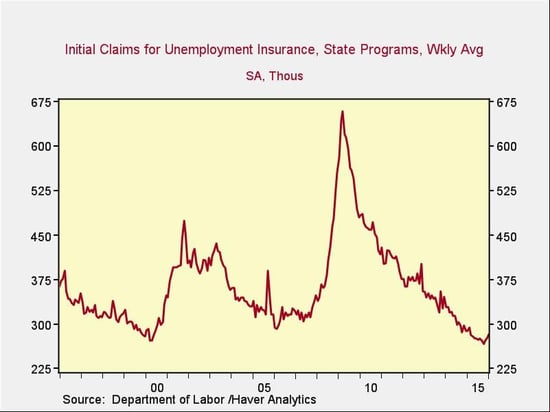
Another way to assess job market strength is to see whether employers are getting rid of employees. If we look at people filing for unemployment, we can see that, again, we are at the levels of the 1990s and better than the best of the 2000s. By this metric, we are also in a boom.

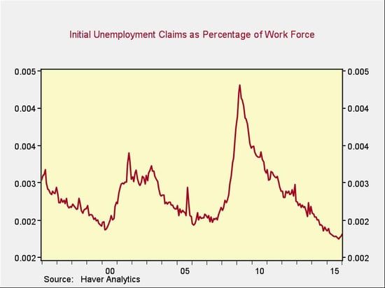
The workforce now, however, is much higher than it was in the 1990s or 2000s, so the reduction in layoffs is even more striking than it seems. If you look at unemployment claims as a percentage of the employed workforce, you see that we are doing even better than in the 1990s.

Wage growth moving in the right direction
Another way to gauge the health of the job market is to consider wage growth. Recent wage growth has been disappointing, but there are real questions as to why that is. A recent Federal Reserve paper suggests that a big part of the reason is the retirement of highly paid baby boomers, even as millennials are being hired for good (but entry-level) jobs. At least part of slow wage growth appears to be due to that demographic shift, and not to a weak labor market.
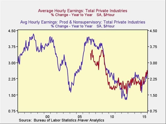
Instead of just looking at recent numbers, which is what most reports do, a better way to analyze wage growth is to look at it over time. This chart combines two data series, each with weaknesses.

The blue line covers production and nonsupervisory workers, which is only a subset of the workforce (and a shrinking one, as the economy shifts away from manufacturing). It does have a longer history, however, and suggests that wage growth is approaching (but has not yet hit) the levels of the 1990s. In any case, this metric is moving in the right direction.
The red line, which covers all workers at private companies, has a shorter history, so we can’t use it to compare directly with the 1990s. But the consistency with the blue line suggests that even the more inclusive numbers are also moving in the right direction and approaching the levels of the mid-1990s and mid-2000s.
Another point to take from this chart is that when wage growth starts—in, say, 1995 or 2004—it tends to do so from a level close to where we are right now, and it tends to be rapid. We saw exactly that kind of growth from 2012 through 2014, and we may be seeing a resumption after a pullback caused by the slowdown in 2014–2015. This chart suggests that, while wage growth is not yet at peak levels, it is reasonably consistent with the early stages of a boom.
All signs point to a boom
As job growth continues strong, layoffs are at extreme lows, and even wage growth shows behavior consistent with the early stages of a boom, it is getting harder and harder not to characterize it as such. There are still headwinds, to be sure, but I'm going to be using fewer and fewer qualifiers—and the day when I drop them entirely will probably come sooner than you might expect.


 Print
Print


