Print
Print Market risks come in three flavors: recession risk, economic shock risk, and risks within the market itself. So, what do these risks look like for March? Let’s take a closer look at the numbers.
Recession risk
Recessions are strongly associated with market drawdowns. Indeed, 8 of 10 bear markets have occurred during recessions. As I discussed in this month’s Economic Risk Factor Update, right now the conditions that historically have signaled a potential recession are not in place. There are signs of weakness, with consumer confidence going to yellow. But on an absolute basis, all the major signals are solid—with strong job growth, healthy levels of consumer confidence, and expansionary business confidence. As such, economic factors remain at a green light.
Economic shock risk
There are two major systemic factors—the price of oil and the price of money (better known as interest rates)—that drive the economy and the financial markets, and they have a proven ability to derail them. Both have been causal factors in previous bear markets and warrant close attention.
The price of oil. Typically, oil prices cause disruption when they spike. This is a warning sign of both a recession and a bear market.
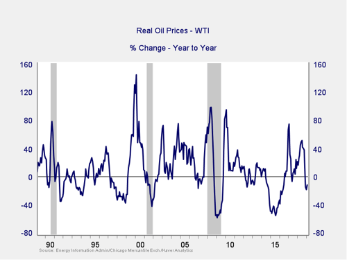
A quick price spike like we saw in both 2017 and 2018 is not necessarily an indicator of trouble, especially as the subsequent declines took this indicator well out of the trouble zone. With the recent drop in oil prices, they are actually down over the past year, suggesting no risk from this factor. Therefore, the indicator remains at a green light.
Signal: Green light
The price of money. I cover interest rates in the economic update, but they warrant a look here as well.
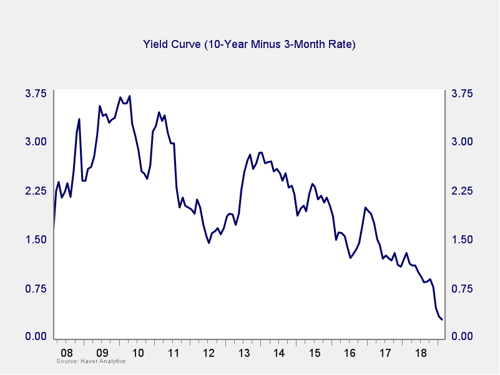
The yield curve spread narrowed further in February, as longer-term rates continued to pull back on rising concerns about growth. Still, the spread remains well outside the trouble zone. As such, the immediate risk remains low, compounded by the fact that lower long-term rates are helpful economically. Given that, and the fact that the Fed has signaled a pause in rate increases, the risk level seems to be moderating. But the continued narrowing, combined with more recent market pullbacks, suggests the indicator remains something to watch. So, I am keeping this measure at a yellow light this month.
Signal: Yellow light
Market risk
Beyond the economy, we can also learn quite a bit by examining the market itself. For our purposes, two things are important:
- To recognize what factors signal high risk
- To try to determine when those factors signal that risk has become an immediate, rather than theoretical, concern
Risk factor #1: Valuation levels. When it comes to assessing valuations, I find longer-term metrics—particularly the cyclically adjusted Shiller P/E ratio, which looks at average earnings over the past 10 years—to be the most useful in determining overall risk.
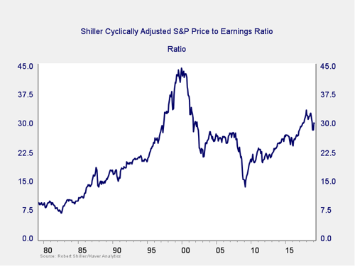
The major takeaway from this chart is that despite the recent decline, valuations remain extremely high. They are still above the levels of the mid-2000s, although down from recent highs. Also worth noting, however, is the very limited effect on valuations of the recent pullback in stock prices. Despite the drop, stocks remain quite expensive based on history. High valuations are associated with higher market risk—and longer-term metrics have more predictive power. So, this is definitely a sign of high risk levels.
Even as the Shiller P/E ratio is a good risk indicator, however, it is a terrible timing indicator. To get a better sense of immediate risk, we can turn to the 10-month change in valuations. Looking at changes, rather than absolute levels, gives a sense of the immediate risk level, as turning points often coincide with changes in market trends.
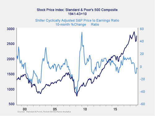
Here, you can see that when valuations roll over, with the change dropping below zero over a 10-month or 200-day period, the market itself typically drops shortly thereafter. After the decline at the end of last year took the market into the risk zone, recovery in the past couple of months has taken us back close to even. Given the recent recovery in equity prices and the fact that we remain above the levels of 2011 and 2015–2016, I am keeping this indicator at yellow, as we have seen similar declines before without further damage. The continuation of the recovery, however, suggests risks are moderating, so I am taking away the shade of red.
Signal: Yellow light
Risk factor #2: Margin debt. Another indicator of potential trouble is margin debt.
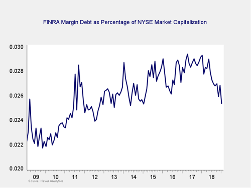
Debt levels as a percentage of market capitalization ticked back down in response to the market recovery. Although margin debt is at the low end of recent history, it remains high by historical standards. The overall high levels of debt are concerning; however, as noted above, high risk is not immediate risk.
For immediate risk, changes in margin debt over a longer period are a better indicator than the level of that debt. Consistent with this, if we look at the change over time, spikes in debt levels typically precede a drawdown.
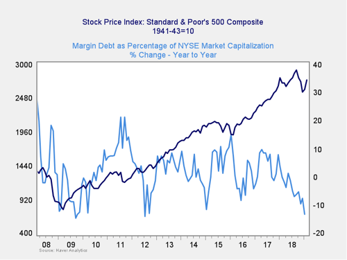
As you can see in the chart above, the annual change in debt as a percentage of market capitalization has continued to drop to well below zero over the past couple of months. This indicator is not signaling immediate risk and, in fact, is showing decreasing risk. Still, the overall debt level remains very high. As such, it is worth watching, so we are keeping this indicator at a yellow light, although there are real signs of improvement.
Signal: Yellow light
Risk factor #3: Technical factors. A good way to track overall market trends is to review the current level versus recent performance. Two metrics I follow are the 200- and 400-day moving averages. I start to pay attention when a market breaks through its 200-day average, and a break through the 400-day often signals further trouble ahead.
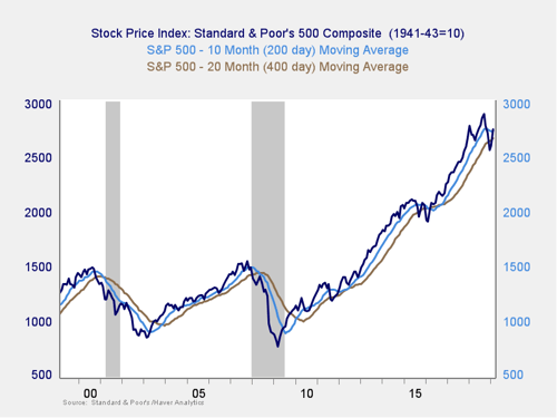
Last year’s declines took all three major U.S. indices below the 400-day trend lines, a significant support level. The subsequent recovery has since brought them back above both that level and the 200-day level, which takes the market back into an uptrend. This switch from downtrend to uptrend is a significant change. Although the risk of the trend turning back to negative remains, investor psychology appears to have shifted. The probability that the markets continue to rebound is therefore more solid; given that, I have taken this indicator back to yellow from red.
Signal: Yellow light
Conclusion: Risks are materially reduced, due to improving conditions
Market risks have been at the yellow light level for the past 11 months and recently dropped even further with the addition of some red lights. But market conditions have improved over the past month, with the continuation of the rebound from the decline at the end of last year. Plus, both political and economic risks have moderated. This takes us away from the red zone but still leaves us solidly in the yellow zone of increased risks.
The continued market recovery is encouraging, the overall economic environment remains supportive, and neither of the likely shock factors is necessarily indicating immediate risk. But the continued volatility and the fact that several of the market indicators continue to point to an elevated level of risk suggest that volatility may return.
As such, we are keeping the overall market indicator at a yellow light. This is not a sign that risks have passed. Instead, it is a recognition that despite the recent market turmoil, basic conditions remain supportive and that while risks are real, the most probable course is more appreciation—even though further volatility is quite likely.