Print
Print Market risks come in three flavors: recession risk, economic shock risk, and risks within the market itself. So, what do these risks look like for April? Let’s take a closer look at the numbers.
Recession risk
Recessions are strongly associated with market drawdowns. Indeed, 8 of 10 bear markets have occurred during recessions. As I discussed in this month's Economic Risk Factor Update, right now the conditions that historically have signaled a potential recession are not in place. Although growth may well have peaked, the economy is still growing—with healthy job growth and high levels of consumer and business confidence. As such, economic factors remain at a green light.
Economic shock risk
There are two major systemic factors—the price of oil and the price of money (better known as interest rates)—that drive the economy and the financial markets, and they have a proven ability to derail them. Both have been causal factors in previous bear markets and warrant close attention.
The price of oil. Typically, oil prices cause disruption when they spike. This is a warning sign of both a recession and a bear market.
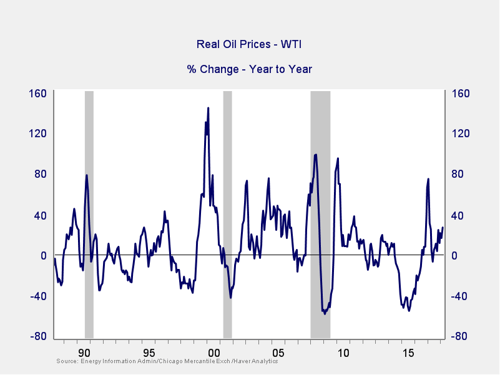
As we saw with the price spike in 2017, a quick spike—it did not appear to reach a problem level and was short lived—is not necessarily an indicator of trouble. The subsequent decline also took this indicator well out of the trouble zone. Although prices have started to rise again, that rise is still modest and may be topping out, suggesting that the risks from this indicator are not yet material. Overall, while rising, risks from this indicator are not immediate, so it remains at a green light.
Signal: Green light
The price of money. I cover interest rates in the economic update, but they warrant a look here as well.
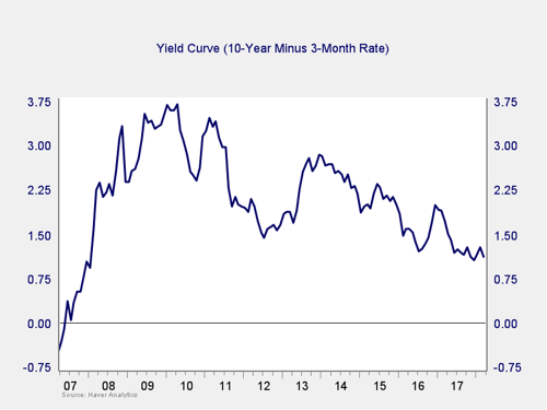
The yield curve spread tightened a bit in March, taking it back toward the post-crisis low in December. But it is still well outside the trouble zone, and the immediate risk remains low. The fact that the spread has tightened again, in combination with the Fed's expected rate increases, suggests that this remains something to watch. I am leaving this measure at a green light for now, but you can see a shade of yellow.
Signal: Green light (with a shade of yellow)
Market risk
Beyond the economy, we can also learn quite a bit by examining the market itself. For our purposes, two things are important:
- To recognize what factors signal high risk
- To try to determine when those factors signal that risk has become an immediate, rather than theoretical, concern
Risk factor #1: Valuation levels. When it comes to assessing valuations, I find longer-term metrics—particularly the cyclically adjusted Shiller P/E ratio, which looks at average earnings over the past 10 years—to be the most useful in determining overall risk.
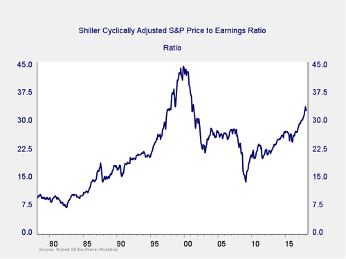
The chart above is interesting for a few reasons. Since the presidential election more than a year ago, equity valuations have increased to levels not seen since the early 2000s. In addition, gains this year have pushed valuations even higher, to the second-highest level of all time. Right now, they are below only 1999, as you can see from the chart.
Despite the recent pullback, valuations remain high—notice that the recent volatility looks quite small on the chart. So, as bad as it feels, it was perfectly normal in historical terms. This illustrates, once again, the importance of keeping a big-picture perspective and looking at individual events in a historical context.
The Shiller P/E ratio is a good risk indicator (and with valuations high, so is the risk), but it’s a terrible timing indicator. One way to remedy that is to look at changes in valuation levels over time instead of absolute levels.
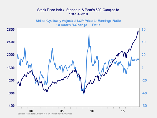
Here, you can see that when valuations roll over, with the change dropping below zero over a 10-month or 200-day period, the market itself typically drops shortly thereafter. Even with the recent volatility, strong stock market performance has kept the long-term trend in valuations at a healthy positive level, well above the trouble zone. Therefore, this indicator shows low immediate risk.
Signal: Green light
Risk factor #2: Margin debt. Another indicator of potential trouble is margin debt.
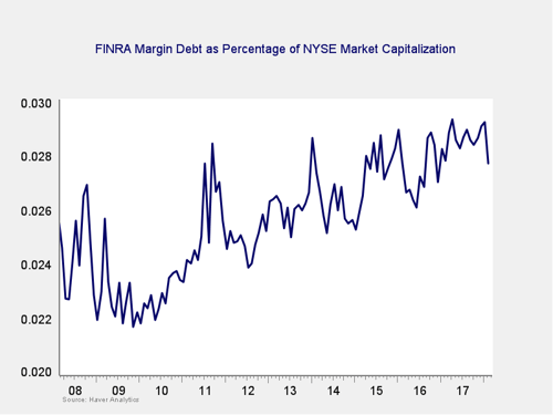
Debt levels as a percentage of market capitalization dropped over the past couple of months. While they are still close to all-time highs, clearly borrowers are derisking—which is a positive sign. The overall high levels of debt are concerning; however, as noted above, high risk is not immediate risk.
For immediate risk, changes in margin debt over a longer period are a better indicator than the level of that debt. Consistent with this, if we look at the change over time, spikes in debt levels typically precede a drawdown.
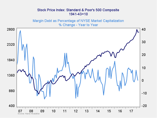
As you can see in the chart above, the annual change in debt as a percentage of market capitalization has ticked down in recent months, moving close to zero. So, this indicator is not signaling immediate risk. But the overall debt level remains very high, and we have seen something approaching a spike in recent months. As such, the risk level remains worth watching. We are keeping this at a yellow light.
Signal: Yellow light
Risk factor #3: Technical factors. A good way to track overall market trends is to review the current level versus recent performance. Two metrics I follow are the 200- and 400-day moving averages. I start to pay attention when a market breaks through its 200-day average, and a break through the 400-day often signals further trouble ahead.
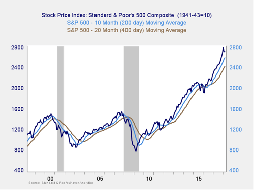
These indicators remain positive, with all three major U.S. indices well above both trend lines. As noted last month, though, the S&P 500 actually dropped slightly below its 200-day moving average on a daily basis on a couple of occasions, then bounced and moved higher. Looking at monthly signals, as this chart does, there has not been a sustained break, but markets continue to bounce around the 200-day line. With no convincing movement either way, the risk of the trend turning negative has risen materially. The most probable case is that the markets may move back up, since they failed to break support even at the nadir. But given the fact that the index did hit its support level, and has not convincingly rebounded above, risks of more volatility have increased. So, I am keeping this indicator at yellow.
Signal: Yellow light
Conclusion: Risks rising, conditions may be weakening
The overall economic environment remains supportive, and neither of the likely shock factors is necessarily indicating immediate risk. But the continued volatility and the fact that several of the market indicators point to an elevated level of risk—combined with the ongoing policy concerns—suggest that volatility may get worse.
As such, we are taking the overall market indicator to a yellow light. This is not an indicator of immediate trouble—the likelihood remains that the market will recover. Rather, it is a recognition that the risk level has increased materially and that, even if the market recovers, further volatility is quite likely.