Print
Print Last week, a reader had an interesting question in response to the Homer Simpson economic video. He wondered, given the number of jobs that Homer Simpson has had and how compensation has changed over time, is there a good analysis of income versus inflation? I didn’t know of any such analysis, so I decided to come up with one. Since much of the analysis around this question is less than clear (to be frank), I also decided to use it as a primer on how to read through economic statistics. As always, caveat emptor!
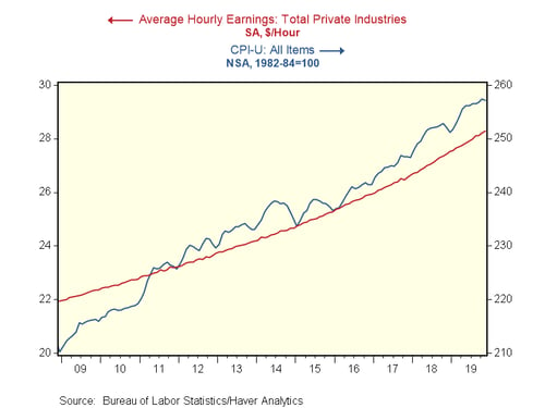
Average hourly earnings: Past 10 years
Let’s start with the most widely reported stat: average hourly earnings for all workers. Below is a simple graph that displays hourly pay against the inflation index. On the face of it, it appears wage income has failed to keep up with inflation over the past 10 years. When we look closer, though, we note that the two series have different scales. Prices have gone from around 210 to 258, or up about 23 percent. Hourly earnings, on the other hand, have risen from about 22 to 28, or 27 percent. Using that analysis, hourly earnings are not only keeping up with inflation, they are beating it.
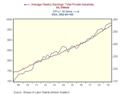
Average weekly earnings: Past 10 years
Hourly earnings are not the best stat for this analysis, as the hours worked are also critically important. The graph below, using weekly pay, corrects for that deficiency. Here, the graph suggests that pay and inflation are roughly in line. But using the different scales, we can see that, again, prices are up about 22 percent, while weekly pay is up from about 740 to 975, or about 32 percent. Once again, weekly pay is not only keeping up with inflation, but beating it.
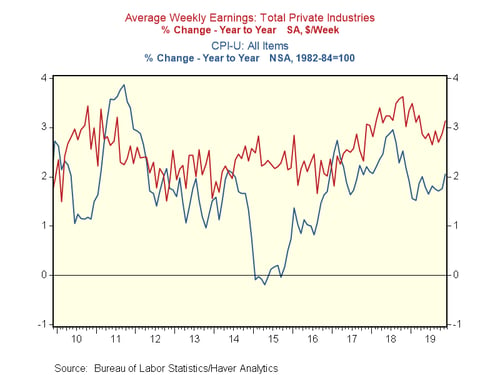
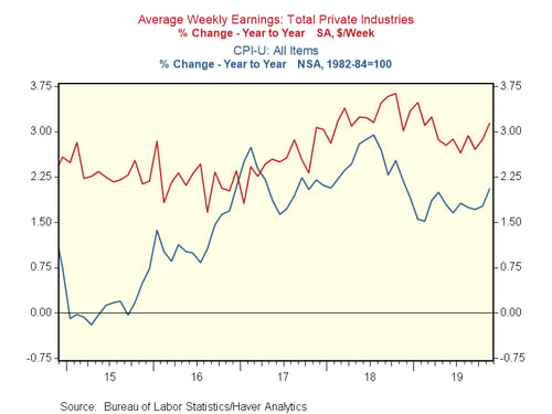
Year-on-year earnings growth: Past 10 years
Another way to look at this data is to compare the growth over time of the two series. Below, we have the year-on-year growth rates for both. We can see that for part of the past decade, especially in the early period, inflation was higher than earnings growth. Further, for most of the rest of the decade before 2014, inflation ate up almost all of the earnings growth. Since then, however, earnings growth has consistently beaten inflation.
Let’s take it down one more level. The past 10 years is a useful time frame for analysis, but most people’s memories are shorter. In any event, you have to pay your bills today. What if we look at shorter periods?
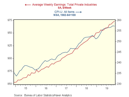
Average weekly earnings: Past 5 years
For the past five years, the graph again suggests that weekly pay and inflation are roughly in line. But using the different scales, we can see that prices are up about 9 percent, while weekly pay is up about 26 percent. Once again, weekly pay is not only keeping up with inflation, but beating it. In fact, almost all of the growth over the past decade came in the past five years.
Year-on-year earnings growth: Past 5 years
If we look at the annual changes, we can see earnings growth has been well above inflation for almost all of the past five years. In other words, the average worker is materially better off than he or she was five years ago.
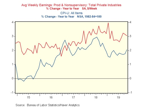
What about the average worker?
One weakness of the analysis so far is that the “average worker” included in the charts above encompasses people who make a lot more than the average worker. But what if we limit the data to the real working people—the ones who are most affected by inflation on a day-to-day basis? We can do just that with the chart below. Here, we see exactly the same thing, with earnings growth outpacing inflation for the past five years.
Good news for 2020
Looking at the numbers, it is clear that earnings growth has outpaced inflation for the past five years, and it is likely to keep doing so. As such, the real purchasing power of workers continues to increase, despite the scary headlines. This analysis also provides an explanation for two otherwise puzzling things: the strength of consumer confidence and consumer spending in the face of these headlines. Simply, when people have money to spend and are getting raises, they tend to spend it.
As long as inflation and unemployment stay low, real earnings should keep outpacing inflation. And that is what has kept the expansion going—and is good news for 2020.