 After 15-percent pullbacks in both the first quarter and the middle of last year, the market is moving up toward new highs. The Dow just ticked above 18,000 for the first time since last July, and the S&P 500 is getting close to the 2,100 level, last seen in December. All-time highs are 18,351.36 for the Dow and 2,134.72 for the S&P 500, so we are getting close.
This is quite a turnaround. Two months ago, there were real fears that the oil industry was going under, that China was collapsing, and that the U.S. economy was headed into recession. Even now, first-quarter growth looks anemic at best, oil remains very inexpensive, and company earnings are expected to decline at the sharpest rate since the financial crisis.
How does this square with new highs in the stock market? The answer is valuations.
From any angle, S&P 500 valuation pricey
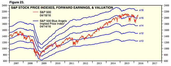
The chart below, from Yardeni Research, shows how investors’ willingness to pay has changed over the past 10 years.

In 2007, investors would pay around 15x expected earnings, which dropped to around 10x in the depths of the crisis, only to move back up to around 14x in the recovery. With the pullback in 2011, valuations dropped back down to 10x, but since 2013, they have never fallen below 14x and have mostly stayed at 15x to 16x—or even higher, as right now.
Let’s think about what this means. Current prices are substantially higher than they were in 2007, based on expected earnings. In the first quarter, with the 15-percent drop, prices only dipped to where they were in 2007. At their worst in the first quarter, they were almost half again higher than they were in the last significant pullback in 2011.
Any way you look at it, based on recent history, the market is expensive.
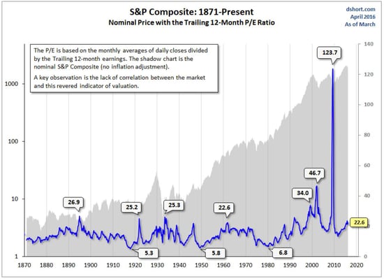
These numbers, however, are based on expectations for earnings. What if we looked at valuations based on actual, trailing 12-month earnings? The following chart does just that.

Here, you can see that the current S&P 500 valuation might be described as cheap—but only if you look at just the past 30 years. Over the entire history of the market, we are now at the seventh-highest level. If you take out the late 1990s and 2000s, we are at the fourth-highest level. And that even includes the spike in 2009, which resulted from company earnings collapsing, not from prices increasing. Excluding that, we’re at sixth and third. That’s expensive.
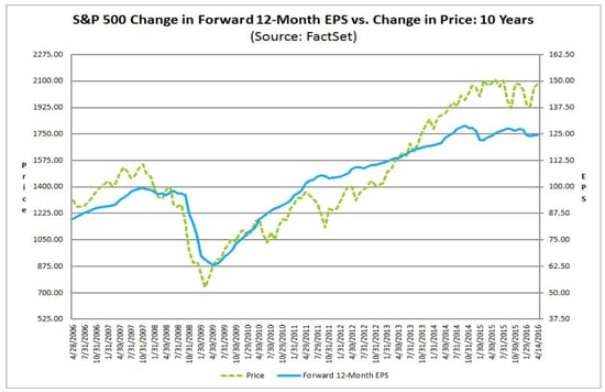
Another way to look at this is to compare company earnings with the stock price index, as in this chart from FactSet.

You can see that stock prices have generally followed earnings, and the topping of the market over the past 18 months has coincided with the flattening of earnings growth and some decline in earnings over the same time period. This is all very rational, except now the market is rising while earnings are still falling, widening the gap.
Going forward, mind the gap
Stocks go up for two reasons: earnings rise, or people are willing to pay more for the same earnings. All of the gain so far this year has come from a rise in confidence and willingness to pay, even as actual earnings are expected to decline.
For the market to continue rising, one of two things has to happen:
- Earnings have to start rising again, or
- Investors have to get even more confident than they already are
Earnings are expected to decline over the next couple of quarters (although, in my opinion, they will do so by less than expected), so the benefit of that, if any, will be limited. At the same time, with valuations as rich as they are, there’s still room to increase, and that looks like it might be happening. Expensive does not rule out even more expensive.
Rising stock prices, as valuations increase, will feel good and make everyone look smart again. We’re seeing that right now. But the growing gap between stock prices and earnings will continue to raise the chances of a deeper pullback.
Enjoy the stock market’s drift upward. Just keep in mind that, with the ground getting farther away, any fall is going to hurt.


 Print
Print


