Print
Print Most of today’s headlines center around the rapidly growing number of coronavirus cases here in the U.S., with some comment on the fact that the number of cases in Italy also continues to grow rapidly. Occasionally, we also get a note that case growth in China has largely stopped.
Are case counts misleading?
This is all good information. But because of the way epidemics and other exponential processes work, anything that depends on case counts is essentially misleading. Any exponential process is initially almost unnoticeable on a case-count basis but eventually turns into a juggernaut, with case counts rising, well, exponentially. The appropriate metric here is not case counts. Instead, it is percentage changes, as that metric reflects the growth rate and is a better early sign of improvements—or the reverse.
Another thing that case counts miss is the base population size. Larger countries can be expected to have more cases, other things being equal, simply because there are more people to catch the disease. Population size is part of what is driving the larger number of case counts in the U.S. than in Italy, since there are more people here.
So, where are we now?
There are a couple of ways to deal with these problems. One is to put case counts on a per unit of population, which is what datagraver.com does, using a base of cases per 100K of population. As you can see in the chart below, this method gives us a standard means of comparison.
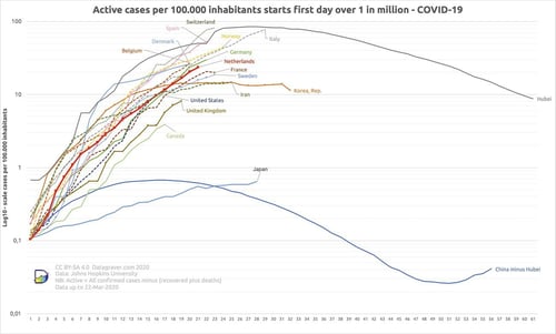
Source: Datagraver
Also worth noting is that the vertical scale is logarithmic, which means each unit is not a fixed number (e.g., 100 or 1,000) but 10x the previous number. This is the appropriate scaling for exponential functions, as it captures the percentage increase-driven expansion instead of the exploding raw numbers. This is a good chart in that it captures the underlying process, as well as the absolute numbers.
But it is not, in my opinion, the best chart to determine how a country is doing—and what can reasonably be expected going forward. To get a more useful presentation of the data, I took the daily case counts from worldometer.com and created the following chart that looks at daily percentage changes in case counts for the world, the U.S., Italy, and Iran.
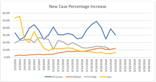
Source: Worldometer
There are a couple of noteworthy trends here. First, the global case growth rate has been trending up this month and is now more than 10 percent. Second, both Italy and Iran have seen infection growth rates come down. Third, the U.S. case count growth rate has held between 25 percent and 50 percent, with a central tendency around 30 percent. U.S. growth rates were consistent with or below those of Iran and Italy at the start of the month, but they are now well above both. The growth in U.S. cases is largely responsible for the increase in the global growth rate as well.
For comparison here, China’s growth rate is essentially zero, as is South Korea’s. Yes, there are new cases, but they are low and declining.
What does this data tell us about the future?
First, other countries around the world are in the process of controlling the virus and limiting its spread. While the new case counts are still getting worse in many areas, the rate of growth is slowing even in the worst hit locations. This slowing growth rate is the first and necessary step in bringing the absolute case count down as well.
Second, the fact that the U.S. case growth rate is holding steady, with some fluctuations, is better than it looks. With testing now ramping up—and with those tests largely being applied to people who almost certainly have the virus—the reported cases are likely growing faster than the actual cases. As such, the fact that the U.S. growth rate is holding steady, even as testing adds more cases, suggests things are actually improving on a case growth basis.
I will be updating the chart above regularly and posting it when warranted. Despite the headlines and the increase in absolute numbers, by the best metric for an epidemic, things are actually at least not getting worse. There is reason to believe things are getting better, as part of the perceived growth is due to better and more widespread testing.
The end of the beginning?
At a minimum, current policies are keeping things from getting worse, and they are buying time for expanded testing and treatments. There is also reason to believe that within the next month, we will see those infection growth rates decrease, as we have seen in other countries with severe epidemics. We are not at the end of the process. But with current policies stabilizing case growth rates, we are likely at the end of the beginning.