 Taking another page from the “things people may not understand” book, today I want to talk about the yield curve. Why? The immediate reason is a spate of coverage in the press about how the inversion of the yield curve may be a signal of trouble ahead, which has prompted questions from clients and advisors. So, let’s take a look at what the yield curve is and how we should analyze it.
Yield curve defined
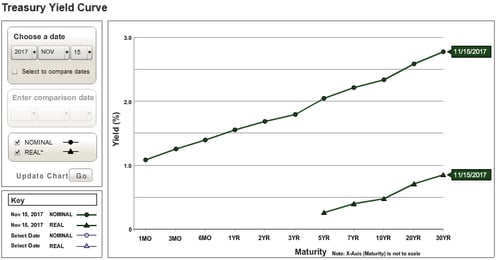
The yield curve, briefly, is the interest rate at which the government can borrow for various lengths of time. This changes from day to day, and it is measured by what government bonds are selling for in the open market. The figure below illustrates today’s yield curve, taken from the U.S. Department of the Treasury website.

You can see one thing very clearly from this chart: longer-term rates are higher than those for shorter-term time frames. When you think about it, this makes sense. When you lend money for a longer period, you face more risks—inflation, primarily. The outlook for inflation over the next decade or more is considerably less certain than the outlook over the next couple of months, and lenders want and need to be paid for that risk. This is why the yield curve is (as you can see) upward sloping. Longer rates are higher, and should be higher, than short-term rates in a growing economy.
The effect of varying interest rates
Interest rates can change, however, depending on market conditions. They are set in the open market between buyers and sellers. The Fed—and this is a common misconception—does not set interest rates. What it actually does is set a target for a very specific rate. It then buys and sells securities in the market to get that rate to its target. So, even here, the rate is set in the markets. Longer-term rates typically are based on that target but can vary significantly. The Fed can point a direction, but it can’t make the markets move. That depends on investors.
As such, rates can vary depending on how those investors perceive the future, which can change considerably in a short time. This is why interest rates can (and do) vary even while Fed policy remains fairly consistent.
The risks of the inverted yield curve
In the figure above, you can see the curve slopes up, with longer rates higher than shorter rates. This is normal for an expanding economy. But what if short-term rates moved higher than longer-term rates? In that case, the yield curve can become downward sloping or, in the jargon, invert. An inverted yield curve has historically been a sign of pending economic trouble.
An inversion of the yield curve can happen in two ways: short rates can rise or long rates can drop. (Usually, we see a mix of the two.) Both are signals of trouble. Higher short-term rates make it more expensive to borrow, slowing consumer spending on things like cars and making business borrowing more expensive. At the same time, long rates typically reflect future growth expectations. So, if long rates drop, the future begins to look darker, even as the present gets more expensive if short rates rise. And if both happen at once, as is often the case? There is a double whammy. Either way, the signs are bad and a mix of the two is even worse. This is why the yield curve matters and why people are talking about the risks of an inversion.
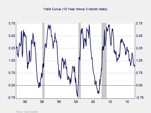
Here's an effective way to highlight the risks indicated by the yield curve: simply subtract the short rate from the long rate so that when the short rate is higher than the long rate, the difference is below zero. You can see in the chart below that this does not happen often. But when it does, a recession (the shaded area) follows shortly thereafter.

As discussed, from a fundamental perspective, an inversion as a sign of trouble makes sense. As we can see from the chart, this also works empirically. For the past three recessions, the yield curve has inverted a year or two beforehand.
Keep an eye on the yield curve
This is what the inversion of the yield curve means, and why you should care. It is also why I use it as a primary economic indicator in the monthly economic risk factor update. Right now, of course, we are not anywhere near the trouble zone. But we are closer than we have been since the crisis. It’s worth keeping an eye on—and now you know why.


 Print
Print

