 As you may remember, the original estimate for first-quarter U.S. GDP growth was a none-too-exciting 0.2 percent. Today’s revision reduced that to a downright depressing decline of 0.7 percent.
In this light, the slow growth problem I mentioned yesterday sounds optimistic, right?
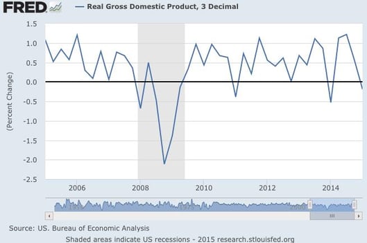
Today’s number is, in fact, representative of problems in the data, but not in the obvious way. To understand why, let’s look first at the following chart from the Federal Reserve, which shows quarterly changes on an annualized basis.

We see that growth has bounced around quite a bit over the past 10 years, but results over the past 5 years don’t look materially worse than in the mid-2000s. It also seems that growth hasn’t changed significantly during the past several years.
But here’s another way of looking at it
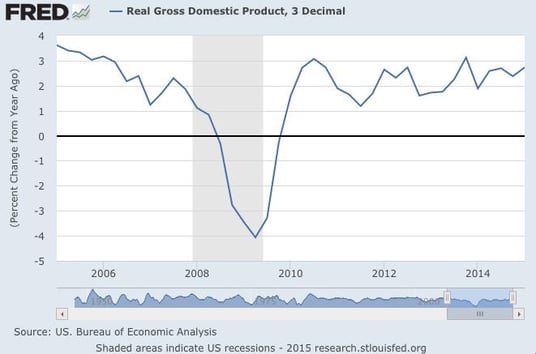
Let’s switch lenses and look at growth on a year-to-year basis.

In this chart, we see something different. Year-on-year growth has actually been increasing since about 2011 and is approaching the levels of the mid-2000s. In this context, weak first-quarter growth looks more like a blip, one that won’t, by itself, derail the economy’s progress.
Why quarterly changes are suspect
A strong quarter (like the fourth quarter of last year) may be followed by a weak one (like the first quarter of this year), giving rise to a quarter-on-quarter decline, which is what we just saw. At the same time, though, overall growth, on an annual basis, may be improving—again, as we just saw.
Using quarterly data is like looking at a tree through a microscope: you can learn a lot about some things, but not about the tree itself.
A bad first quarter, particularly when we can fairly clearly identify temporary causes, is nothing to be especially worried about. Signs are good that growth will continue. And although the second quarter may not be as strong as last year’s, that would by no means indicate a move back into recession.
What about the slow growth problem?
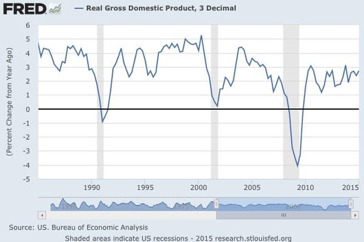
Let’s change the lens again, this time by expanding the time frame. The chart below shows real economic growth, year-to-year, over the past 30 years, from 1985.

A couple of points stand out:
- Growth over the past five years has indeed been lower than in previous recoveries, particularly the 1980s and 1990s.
- During the 2000s, though, while we did see a growth spike in the middle of the decade, the average doesn’t appear all that different from the average over the past five years.
The question here is why. I think this provides a good framework for considering the difference in growth rates and whether slow growth is likely to persist. I wrote about this briefly in a recent post, and in the next several days, we’ll take a deeper look at where growth comes from, what that meant in past decades, and what it means now.


 Print
Print


