One of the more interesting ads in a generally disappointing Super Bowl—I know I wasn’t the only one looking forward to a much more exciting confrontation between the number-one offense and the number-one defense—was the puppet-maker who supposedly quit her job on national TV. I have to say, if it was real, it took guts. If the new business doesn’t work out, she may have a hard time going back.
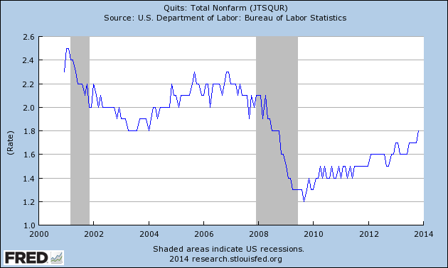
Quitting is a difficult thing to do, especially when you don’t have a replacement job lined up, which is why the “quit index” is a pretty good indicator of when employment is improving. The more workers are willing to walk, the more confidence they show in being able to get another, presumably better, job. This is, in fact, an actual statistic tracked by the Labor Department, and it’s said to be one that Janet Yellen follows.
You can see from this chart that people are getting more willing to quit overall. While we’re not quite at the levels of the 2000s, we are getting pretty close and are certainly moving in the right direction.
Finding other ways to look at employment has become important since the recent job creation numbers from the establishment survey are very inconsistent with other data (particularly the household survey), and we need to figure out which one is right. If the establishment survey numbers are right, we’re looking at a significant slowdown in job growth, with serious consequences. If all of the other data is right, though, then the recovery continues. It matters.
The quit rate is one stat that’s pointing in the right direction, as it shows increasing confidence in people on the front lines, the actual employees. One data point isn’t enough, though.
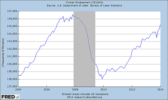
Another data point, which is actually coequal with the establishment survey and serves as the basis of the unemployment figures, is the household survey. It can be parsed to give us a wide range of numbers. If we look at civilian employment, for example, we see that total employment continues to grow, despite a recent dip.
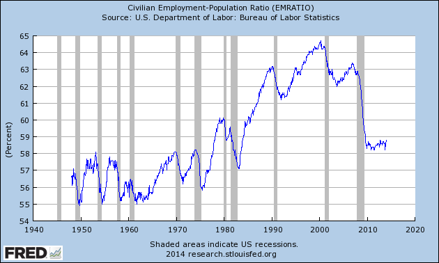
Another way to look at this is the ratio of employment to population, which takes into account the fact that we need more jobs as the population grows; if jobs grow more slowly than population, we have a problem, even if the total number of jobs increases.
This chart provides some interesting data. First, the employment-to-population ratio, while below the levels of the past 20 years, is still above the levels of the 1950s through 1970s. (This deserves a post of its own, so I will just note it for now.) Second, the ratio bottomed out above the levels following the 1982 recession. Third, as reinforced by the second point, the ratio appears to have leveled out and most recently to be ticking up. This chart reflects the very serious damage that has been done, as well as the stabilization and recent uptick. It will be a good chart to watch going forward.
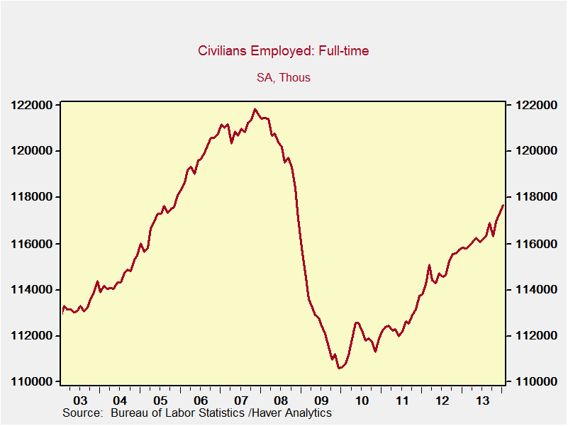
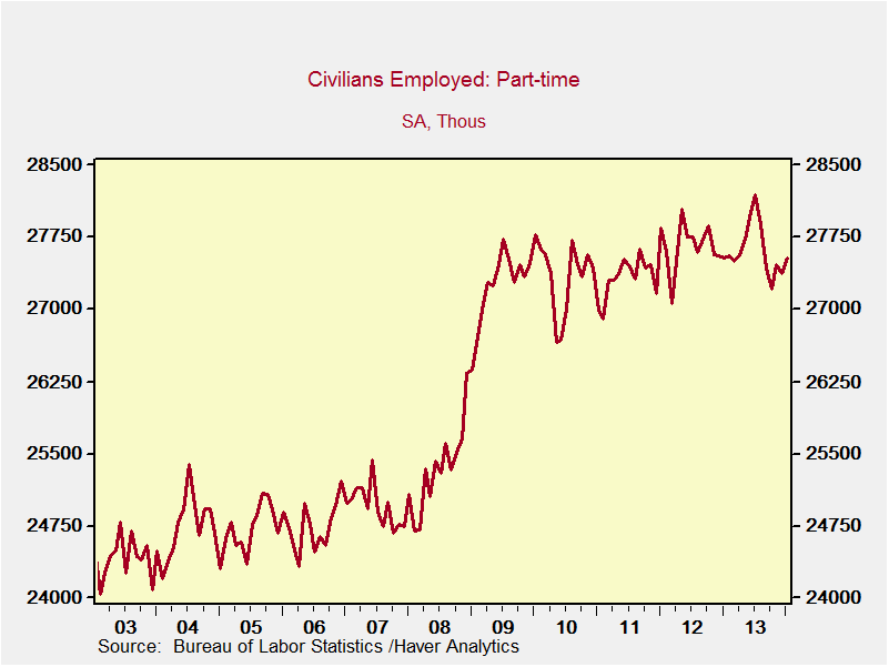
One final way to look deeper at the employment numbers is to examine the growth in full-time jobs versus part-time jobs. If total jobs are increasing, as they are, but they’re mostly part-time, that doesn’t solve the problem.
Here, we can see that full-time employment continues to increase. While not back to pre-crisis levels, it is moving in that direction. Part-time, employment, on the other hand, has actually stabilized. So, full-time employment is an increasing part of total employment, which is a positive factor going forward.
Much of the angst generated by the December jobs report, and to a lesser extent by the January jobs report, was based on the much weaker-than-expected job creation numbers. In December, the weather appears to have been the principal reason, but that explanation doesn’t work for January.
Sometimes, though, the numbers are just strange for unexplainable reasons. You can’t assume that, of course, but this is why we follow multiple data series, using different survey groups and methodologies. This is exactly why there are two different employment data sets, one based on business and the other on households, along with other supporting data sets like the ones we just examined.
Looking at the bigger picture, it appears there may be some degree of slowing in hiring, but the bulk of the data suggests that things continue to improve. This explains why the market actually rose on the release of the January figures, despite the fact that they were below expectations.
It also reinforces the need to look below the surface of the numbers, to understand where they come from and what they actually mean. This is important in any discipline, but in economics and investing, it is vital.


 Print
Print