I wrote Commonwealth’s monthly market update this morning, and one of the topics I covered was the slowdown in the housing recovery. To be sure, I think this is just a slowdown to a more sustainable level of growth, but looking at it made me think about what I really consider some of the best indicators for future economic performance.
As you know, consumer spending represents more than two-thirds of the economy as a whole, so the consumer is paramount when considering where we’re going. We have multiple surveys of consumer confidence, which remains at high levels, and many data points on how much consumers are spending, but each of these is subject to revision, massaging, assumptions, and everything else that goes into the economic-statistics sausage grinder. It can be tough to see anything through the fog. What we need are simpler, easier data points that reflect underlying consumer demand in a clearer way.
Two data points I’ve used during the past couple of years to call the timing and magnitude of the recovery have been housing sales and car sales. I believe these are the best indicators out there for several reasons. First, they represent significant capital investments. Anyone buying a house or car is making a multiyear commitment, and that requires much more thought and confidence than an impulse purchase. Second, they both tend to require third-party financing. Again, this is a significant, multiyear commitment on the part of the lender. Both of these purchases mean that someone and some lender feel good enough about the future to make that commitment.
Third, the timing of these purchases can be managed. You can always drive your old beater another year or renew your apartment lease, so changes in these figures mean something fundamental. Fourth, despite that, these sales reflect basic human needs, so we do have a baseline of demand that can act as a reference point.
The final reason I like these data points is that they reflect what people are actually doing. There is relatively little data massaging and few assumptions built in—people buy a car or house, or they don’t. By looking at what people are actually doing, you clear out most of the fog.
This is relevant because, with increases in mortgage rates and some signs of a slowdown in parts of the economy, the question of whether growth will continue or decline is a very real one. Just as they have over the past couple of years, I think these data points can offer useful perspective on the next 6 to 12 months.
First, let’s look at housing sales. I use existing home sales, as they represent the majority of transactions and are less constrained by other factors than new home sales.
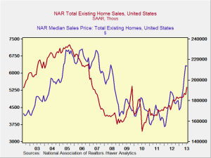
Looking at this chart, you can see that home sales are still increasing through July—and, in fact, at an increasing pace—suggesting that rising mortgage rates haven’t adversely impacted the actual number of transactions. You can also see that the volume of sales remains well below the peak, suggesting that demand—now at 2002 levels—is not being artificially juiced and is sustainable.
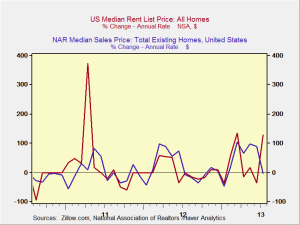
If you look at price, you see the same trend, but . . . prices seem to have gotten a bit ahead of sales, which suggests that we might see some softening on price increases, even while demand remains strong. This is consistent with the chart below, which shows changes in house prices—and which has recently declined. The question is whether house price appreciation will resume, driven by demand.
If we look at rents, per the following chart, we get more relevant information about that. We can see that changes in rents generally are consistent with changes in prices, which makes intuitive sense. Most recently, though, when we see a decrease in the rate of housing price increases, it’s matched with an increase in rental rate growth—suggesting that housing price increases may resume. This would certainly make sense based on the above chart, as prices appear to have gotten ahead of themselves. A period of stability or slower growth will allow prices to catch up with demand, but continued demand should then push prices higher.
Overall, the housing market data suggests that, while recent price increases have slowed, the underlying demand remains strong and price increases may resume—both of which would be good for the economy. It suggests that consumers remain confident enough to keep buying homes, even though that involves a multiyear commitment, and that lenders remain confident enough in the market to allow them to do so.
Based on all of this, the underlying data for housing indicates that the consumer-led recovery remains on track. I’m running out of space here, so we’ll look at car sales tomorrow.


 Print
Print


