Following on the review of how well the housing market is doing, I thought I would take a look at employment.
The common perception is that employment is still way down, and there’s quite a bit of truth to that, in that the unemployment rate is still too high. But if you look at the rates of change and compare the absolute levels with those of the past, things are improving.
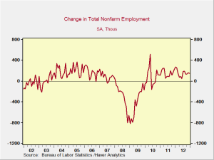
The first thing worth a look is the growth in jobs, as shown in the chart below. The average growth rate for the past year or so is getting pretty close to that of the mid-2000s. This will not, of course, result in immediate jobs for all of the unemployed, but it does suggest that employment growth is on track.
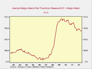
And, in fact, we are making progress on unemployment. The U-6 series, known as the underemployment index—and the most comprehensive index that we have—has been consistently declining, as shown in the next chart. Still way too high, of course, and nowhere near the level of the mid-2000s, but at least it is moving in the right direction.
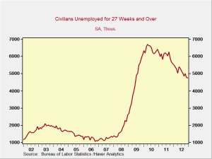
Another encouraging chart, seen below, shows the change in the number of long-term unemployed. These individuals are typically among the most affected and may have the most difficulty finding jobs. Here, too, there has been significant improvement.
In terms of the absolute number of jobs, then, and in the people who are most in need, we are making progress. But that doesn’t address the quality of the jobs or the income generated from them.
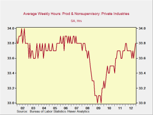
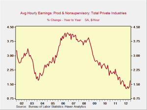
To evaluate those factors, we need to look at two things: the average hours worked and the average hourly earnings. The average hours worked per week are back to levels seen in the mid-2000s, but changes in average hourly earnings are decidedly not at mid-2000s levels, as illustrated in the next two charts. In fact, they are still at decade lows. Even as jobs increase, will we see any increase in wages?
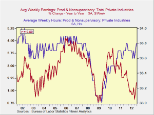
In order to analyze this, I considered the average hours worked per week and graphed that against the changes in hourly wages, with the hypothesis that, as the hours worked increased, the pressure to increase wages would increase, as shown in the final chart.
The trends are visually the same over much of the time period and suggest that, with average hours per week at about 33.7, wages have increased more. The correlation also suggests that this is reasonable. With that said, even though the trend appears to have broken over the past couple years, the recent move of the number of hours worked back above that 33.7 line, combined with the recent uptick in earnings, suggests that we may be at a point where the correlation will reassert itself and wage increases will accelerate.
Getting better despite the political environment
In conclusion, then, jobs are increasing at historically reasonable rates, and unemployment is declining as the excess labor force is absorbed. Wages have not yet really responded to the improving environment, but there is reason to believe that this is either starting to occur or is not that far off. Things are getting better.
Another point worth considering is the political environment in which this improvement has been taking place. It has been just terrible. Uncertainty is anathema to business investment and hiring, and the combination of the fiscal cliff and the pending debt ceiling has been a deterrent to hiring. Because we have made this much progress even under such adverse conditions, I believe that, should Congress get its act together, we may see much stronger progress going forward.


 Print
Print